
Website design / Development
Blunt.
A studio website with a strong point of view and two clear ways to commission design.
- My role
- Website strategy, content structure, art direction, interface design and development.
- Project
- Studio website
01 / THE BRIEF
Make commissioning clearer.
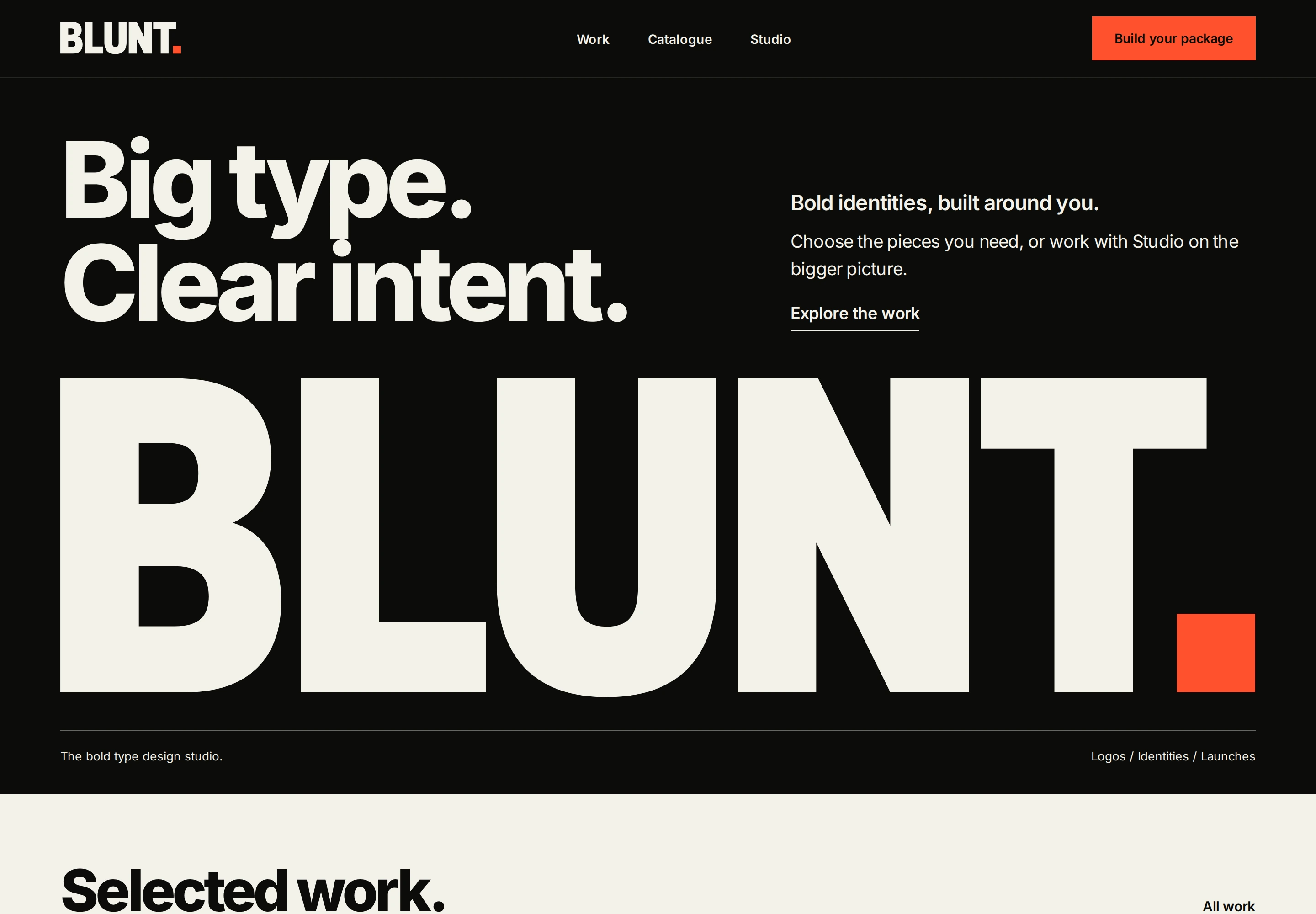
Blunt serves two different starting points. Some people know the design pieces they need; others need an identity, launch or campaign scoped with them. The website needed to make those choices obvious while showing the studio’s type-led creative approach.
It also needed to make a broad service offer feel manageable. A visitor should be able to see the work, understand the deliverables and start a brief without guessing how commissioning works.
02 / THE IDEA
Two routes. One clear point of view.
Let the website behave like the studio: direct, typographic and clear about the next step. Large type establishes the point of view. Project imagery then shows how that approach can take different forms.
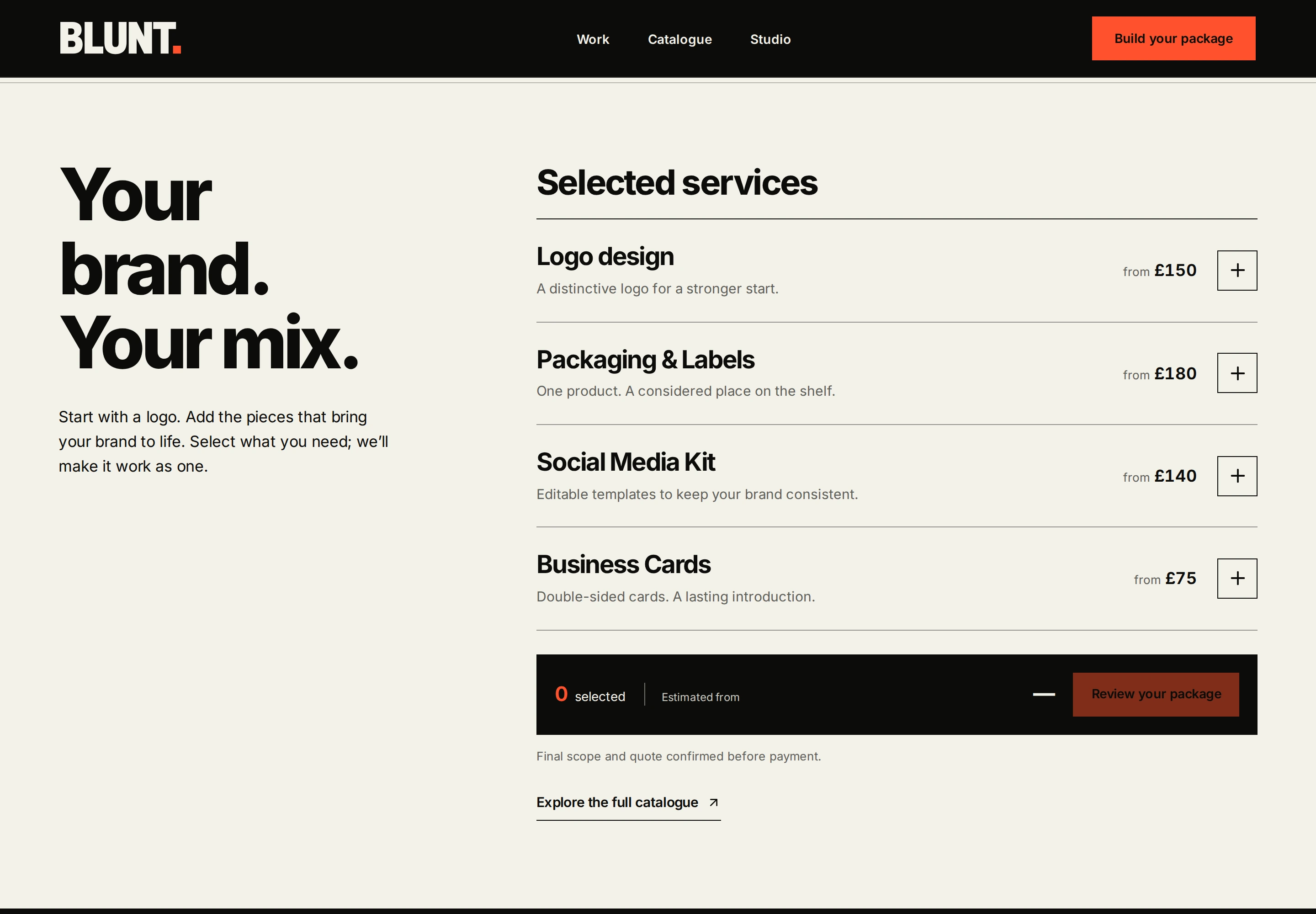
The catalogue and Studio are distinct routes. One helps visitors build a selection of defined deliverables; the other opens a conversation about a broader project.
03 / THE BUILD
A website that helps shape the brief.
I built the website around selected work, an interactive service catalogue, a package review and a separate Studio offer. Each service explains what it includes. Selections feed into a starting estimate and brief; the scope and fixed quote are confirmed before work begins.
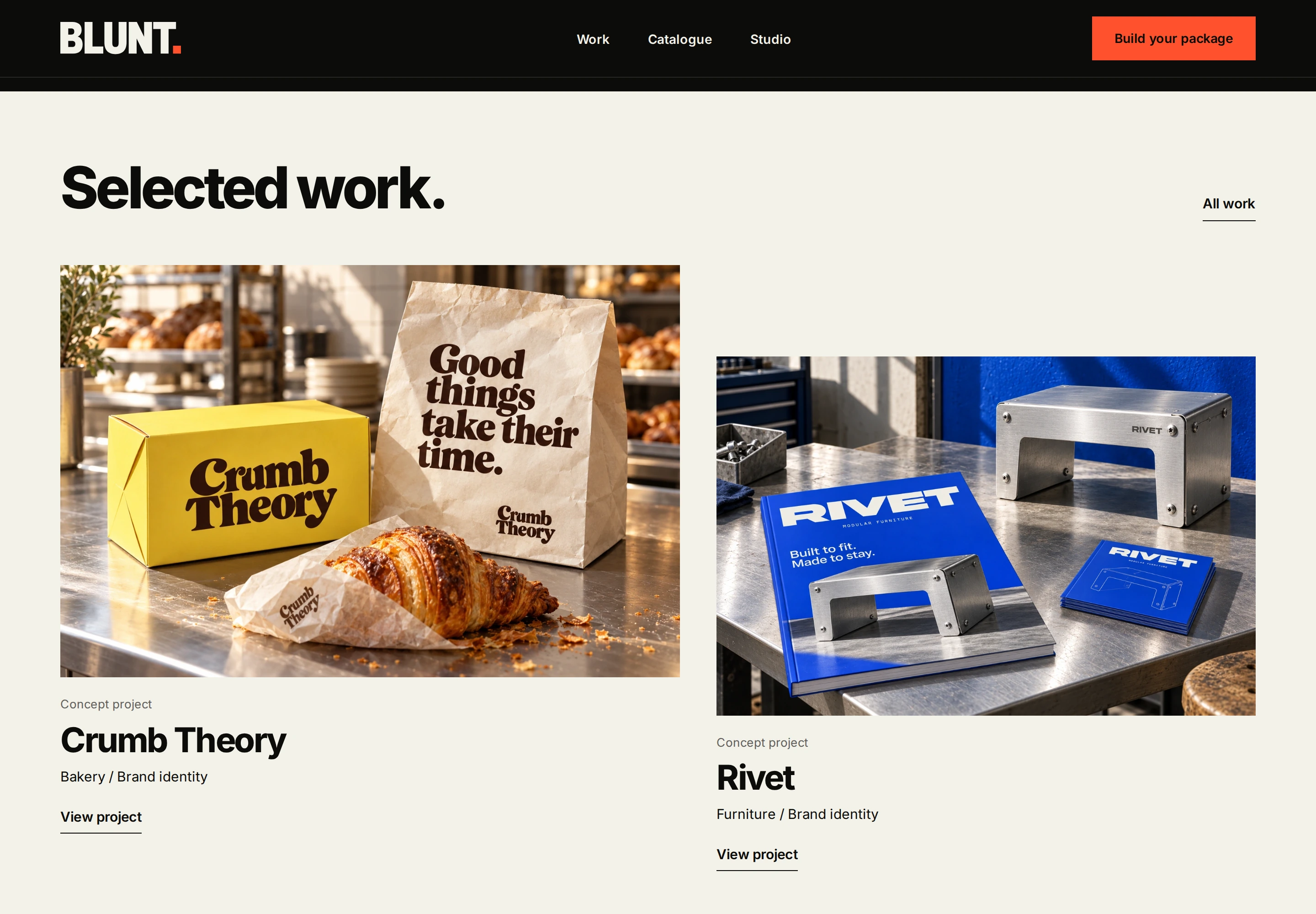
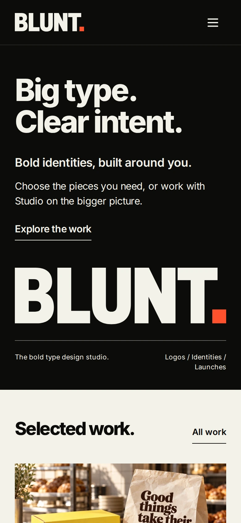
Project pages give the work room to breathe and identify self-initiated concepts clearly. The wider site connects service detail, editorial notes, the public brand guide and enquiry routes. The responsive system carries the same typographic hierarchy from the desktop homepage into mobile menus, catalogue controls and reading pages.
04 / THE SCOPE
What went into it.
- 01
Offer architecture
Separated defined deliverables from broader Studio engagements, then connected each route to relevant work and an enquiry.
- 02
An interactive catalogue
Designed service selection, the package summary and estimate, with clear scope review before a final quote.
- 03
Website art direction
Applied the studio’s type-led identity through scale, contrast, spacing and a restrained ink, paper and orange palette.
- 04
Project presentation
Built selected-work and individual-project layouts that preserve each identity’s character and label concept work accurately.
- 05
Responsive interaction
Developed navigation, mobile catalogue controls, process content, expandable questions and contact routes.
- 06
A maintainable publishing system
Connected portfolio and editorial content with content management, public page generation and page-specific metadata.
IN THE DETAIL
A closer look.
Designed for the smaller screen.
05 / THE RESULT
Where it stands.
A complete studio website that connects creative work to a practical commissioning journey. The catalogue makes individual deliverables easier to assemble, while Studio leaves space to define a larger brief together.
Studio website. Selected work includes clearly labelled concept projects.
Visit Blunt