

Brand identity / Website / Marketing
HubFiiiT.
A workplace wellness identity carried through a website, campaigns, print and merchandise.
- My role
- Brand strategy, identity, website design and development, graphic design and marketing support through PulseFit.
- Project
- Client project through PulseFit
01 / THE BRIEF
Give workplace wellness a clear voice.
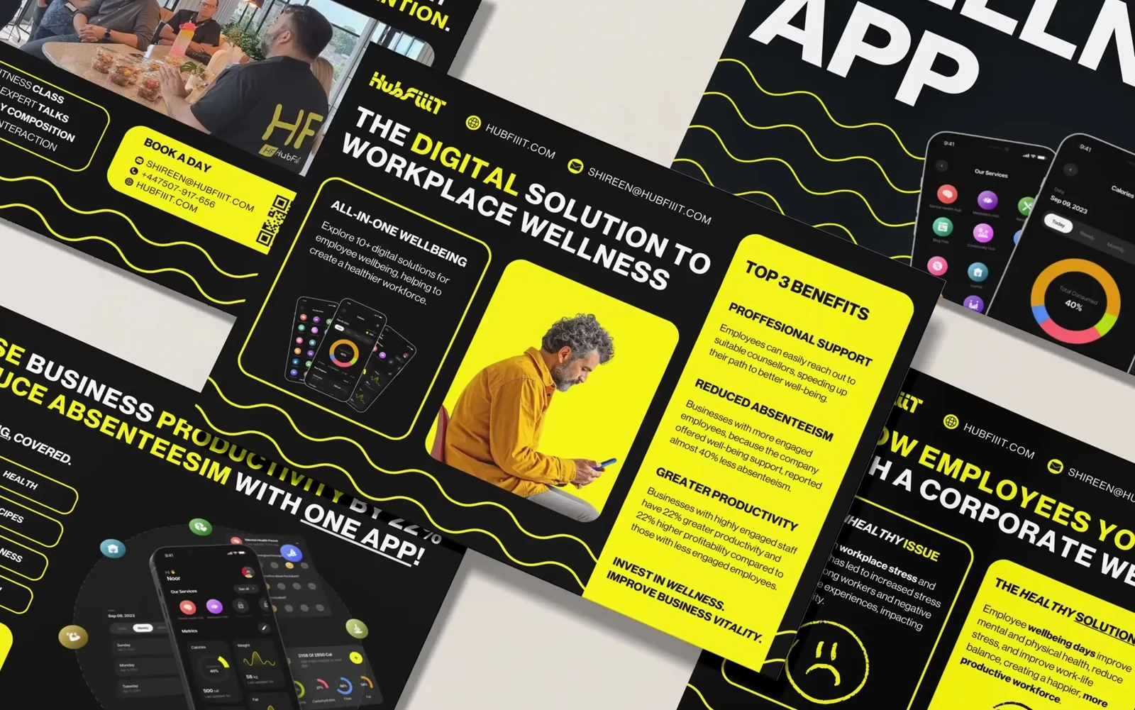
HubFiiiT is a workplace wellness company founded in 2021. It needed a defined identity and clearer positioning to communicate its offer to business decision-makers in a crowded wellbeing market.
The challenge extended beyond the logo. The website, sales and marketing materials, events and everyday communications needed to tell a consistent story.
02 / THE IDEA
Build a language of movement.
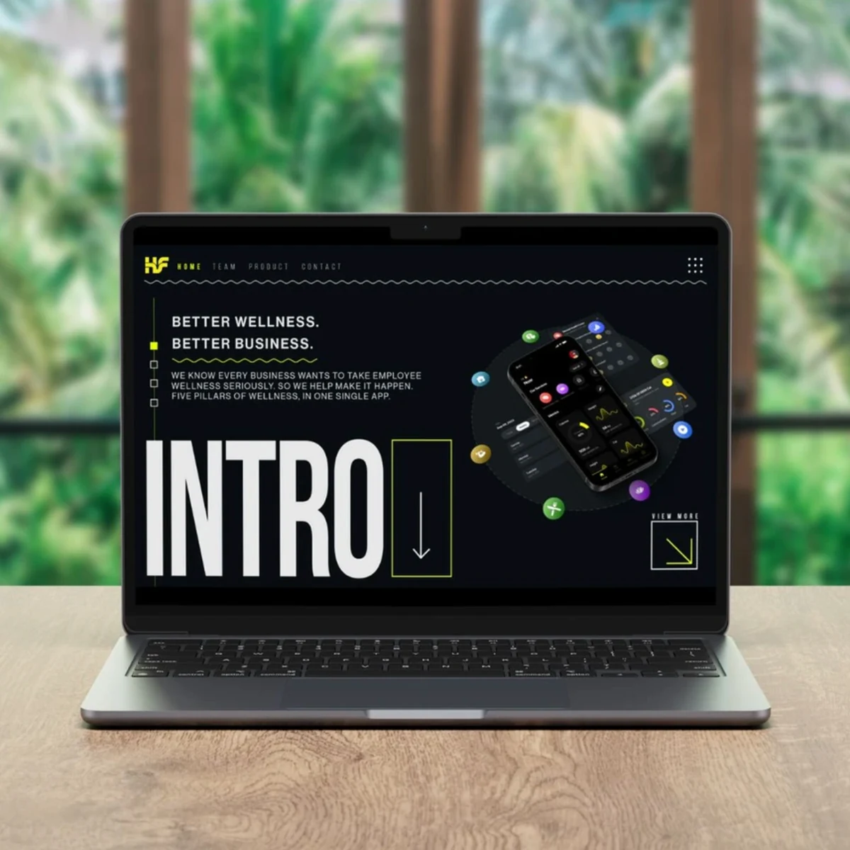
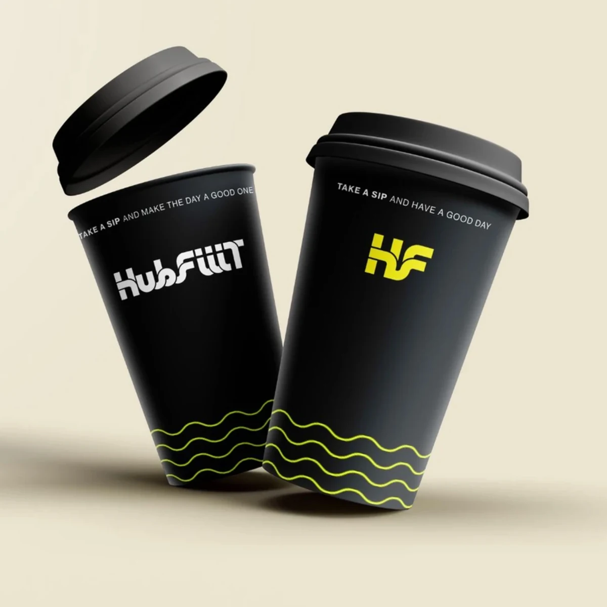
Start with the audience and message, then create a system built around movement and flow. Strong typography, a high-contrast black-and-yellow palette and a flowing line give the wellness offer a distinctive visual language.
That language had to remain recognisable across practical materials, from a website to a nutrition guide or a shirt.
03 / THE BUILD
Carry the identity into everyday use.
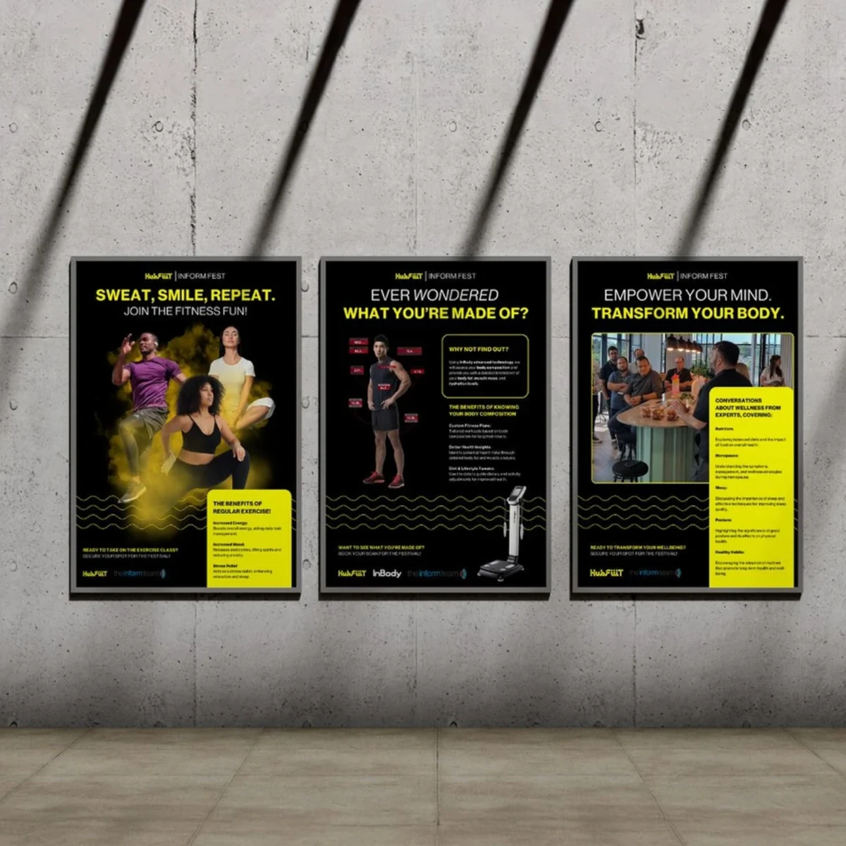
A positioning workshop established the strategic foundation before the identity was developed. The resulting logo, typography, colour and graphic assets were applied to a new website, marketing materials, trade-show branding and promotional items.
The relationship continued through monthly consultancy and design support across social media, email and campaigns. The work shown here brings those applications together as one connected brand system.
04 / THE SCOPE
What went into it.
- 01
Positioning workshop
Defined the audience, message and strategic starting point for the workplace wellbeing offer.
- 02
Visual identity
Built the logo and identity system around typography, black and yellow, and a flowing graphic motif.
- 03
Website design and development
Created a digital home that brings the visual identity and wellness proposition together.
- 04
Communications and print
Extended the system into campaign artwork, practical guides, marketing materials and trade-show applications.
- 05
Merchandise
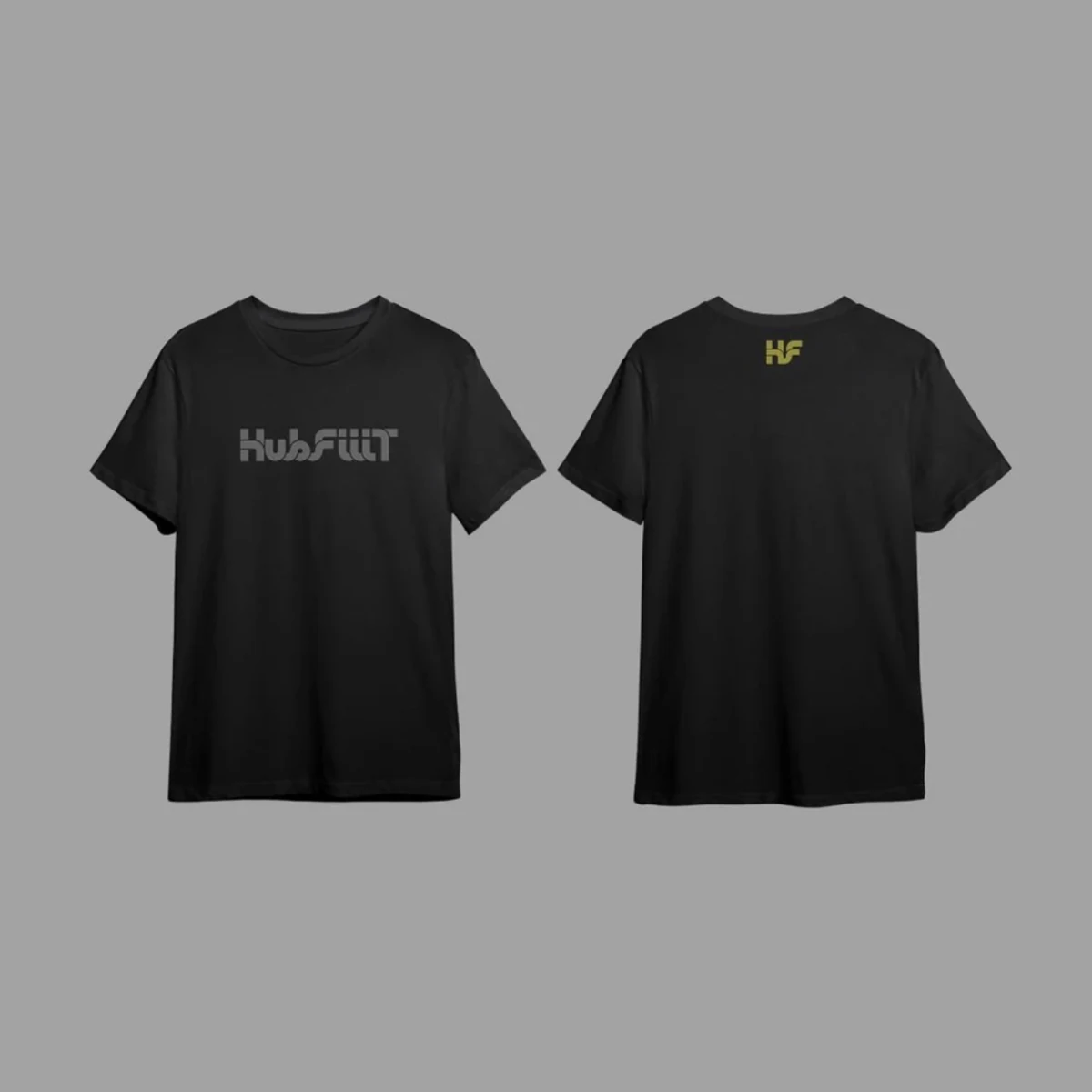
Applied the identity to promotional items and clothing so it remains recognisable away from the screen.
- 06
Ongoing support
Provided monthly consultancy and design support across social, email and campaign communications.
IN THE DETAIL
A closer look.
05 / THE RESULT
Where it stands.
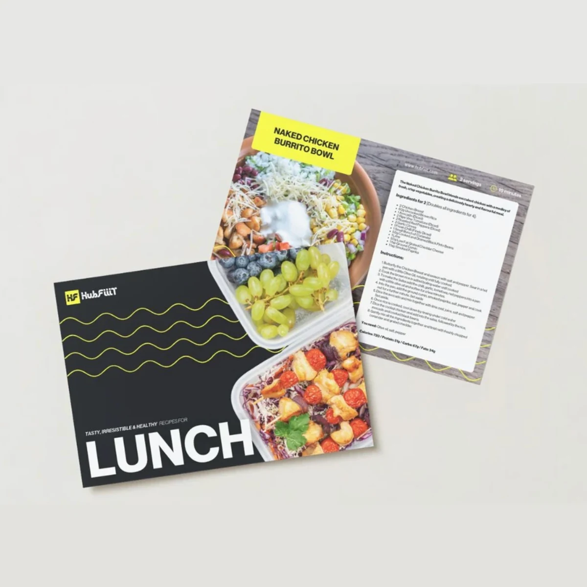
A clear identity and a connected set of digital, print and physical applications, with a consistent foundation for the brand’s ongoing marketing.
Client project through PulseFit · 2024. Original project artwork shown.
Talk about a similar project