

Internal campaign / Graphic design
Think Orange.
A simple, recognisable prompt to bring the brand framework into everyday thinking.
- My role
- Internal campaign communication and poster design.
- Project
- Internal Xpert campaign
01 / THE BRIEF
Make the framework visible.
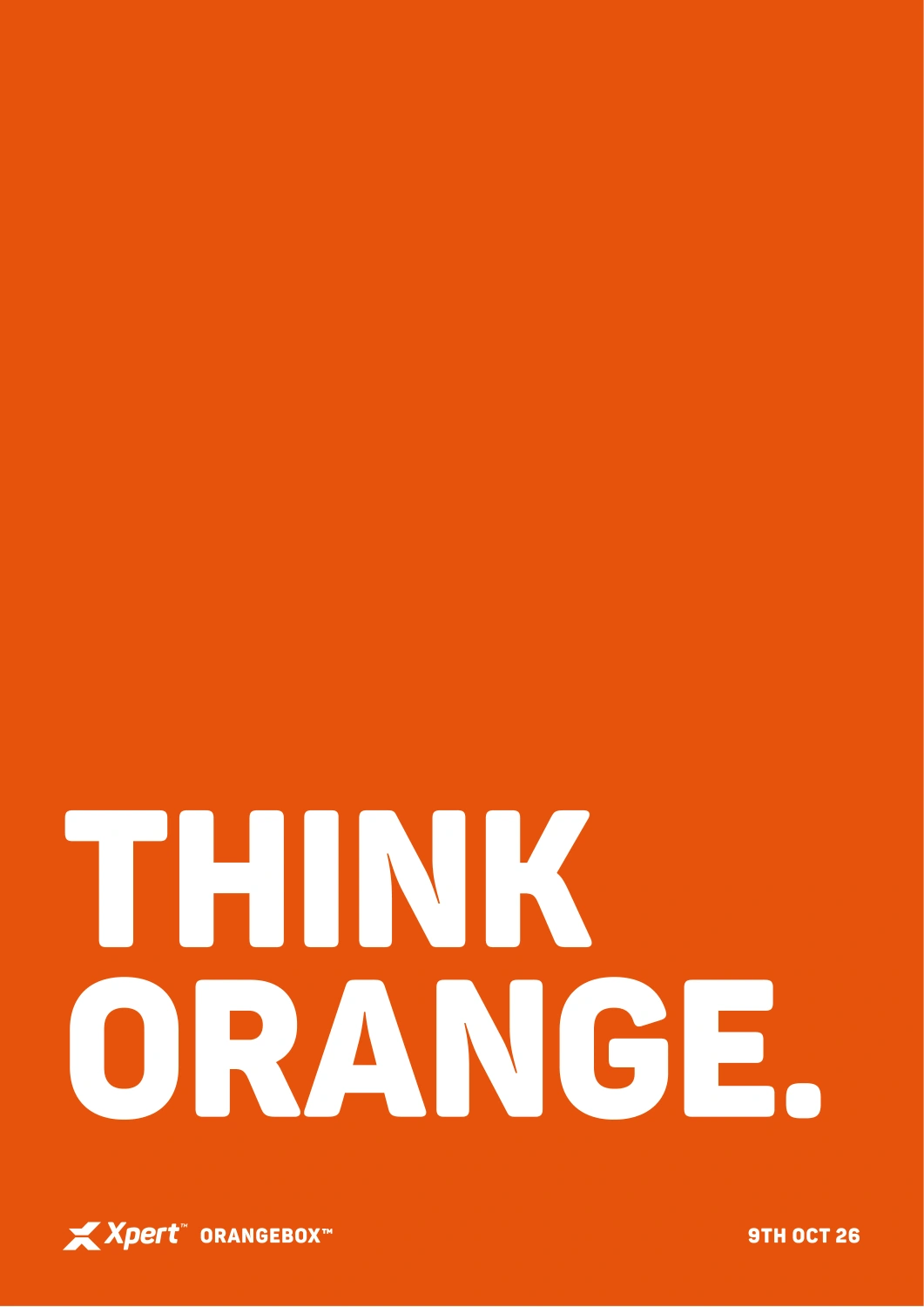
The Orangebox framework needed a visible point of entry for the team. This campaign poster had to be recognisable at a glance and connect a short message to the wider internal brand work.
02 / THE IDEA
Two words. One clear cue.
Let the brand colour carry the instruction. “Think Orange” works as both a memorable phrase and a direct connection to the Orangebox. The message stays deliberately short so the typography and colour can do their job.
03 / THE BUILD
A focused campaign application.
The supplied poster uses the orange field, a strong two-line headline and a restrained footer with the Xpert mark, Orangebox name and 9 October 2026 date. The scale and hierarchy are designed around a single message, without asking the poster to contain the whole strategy.
04 / THE SCOPE
What went into it.
- 01
A clear entry point
Connected a short internal campaign message to the longer Orangebox framework.
- 02
Message hierarchy
Gave the headline the page, with the identity, framework name and date supporting it.
- 03
Brand consistency
Used the existing orange, typography and Xpert signature as the campaign’s recognition system.
05 / THE RESULT
Where it stands.
A focused internal campaign poster linking a memorable message to the brand framework.
Original poster dated 9 October 2026. This case study covers the supplied artwork.
Talk about a similar project