
Identity / Website / Motion
Adventure Sport Marketing.
A personal experiment in making an adventure brand feel like an adventure. Identity, an immersive website and a reason to keep scrolling.
- My role
- Concept, identity, art direction, website design and development
- Project
- Personal project · In development
01 / THE BRIEF
Could the website carry the feeling?
Adventure businesses sell something that is difficult to sum up in a service list: anticipation, a little uncertainty and the moment you commit. I wanted to explore how that feeling could shape a brand and its website.
This was a self-initiated project: room to play with an idea, push the interaction and build something for the enjoyment of making it. The question was how to make the experience feel adventurous while still giving the studio a clear, useful home.
02 / THE IDEA
One mark. A way into another world.
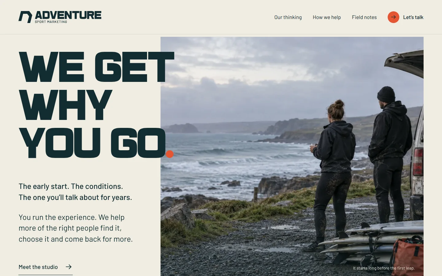
The Entry symbol became more than a logo. Its angled opening became a doorway into another world, connecting the identity to the movement of the website.
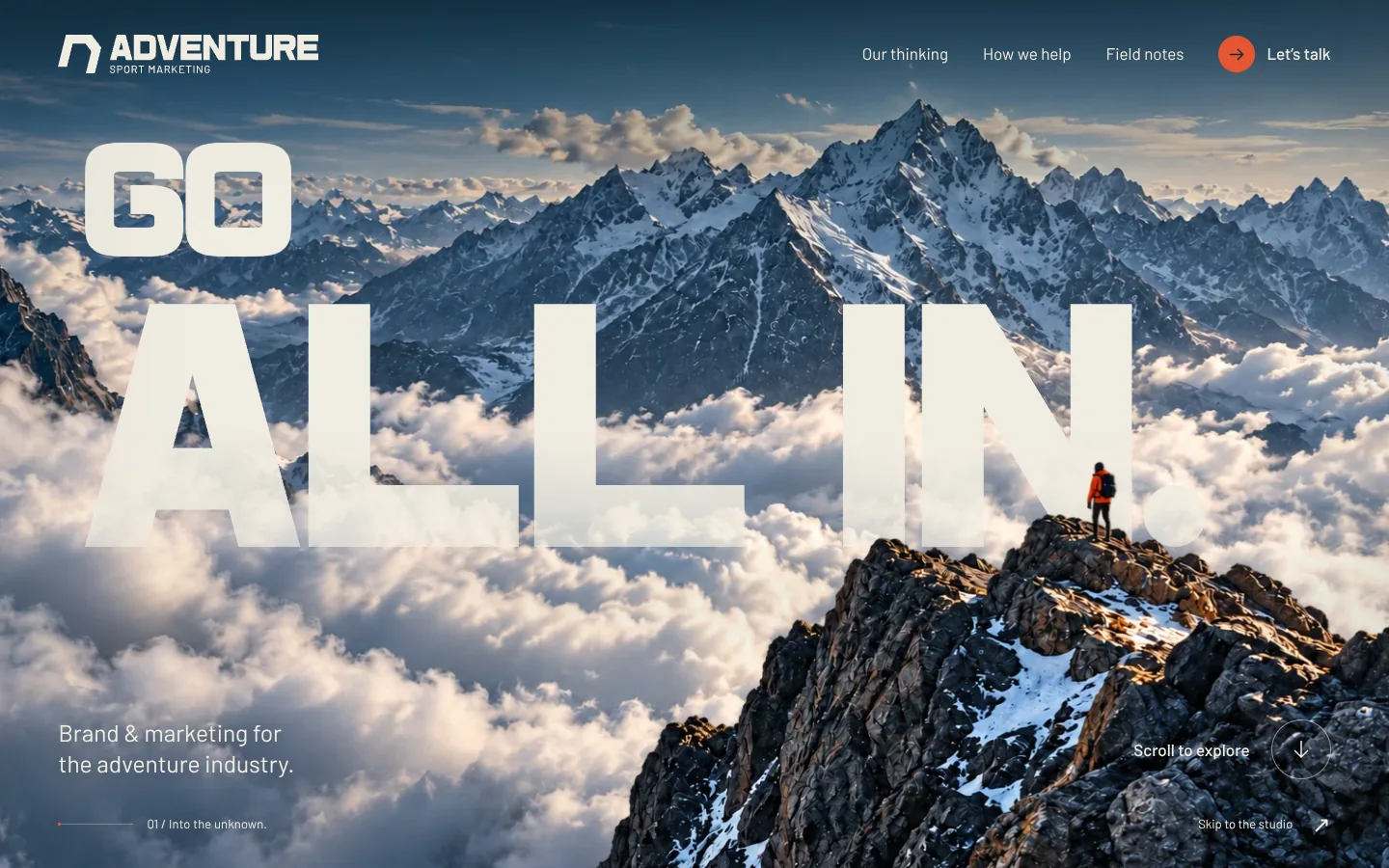
Deep teal, chalk and vermilion give the brand a recognisable frame. The expressive Outland type and the line “Go all in” set the tone; clouds, mountains and the sea give it somewhere to go. The portfolio cover uses that same mark and visual language.
03 / THE BUILD
From the mountain to below the surface.
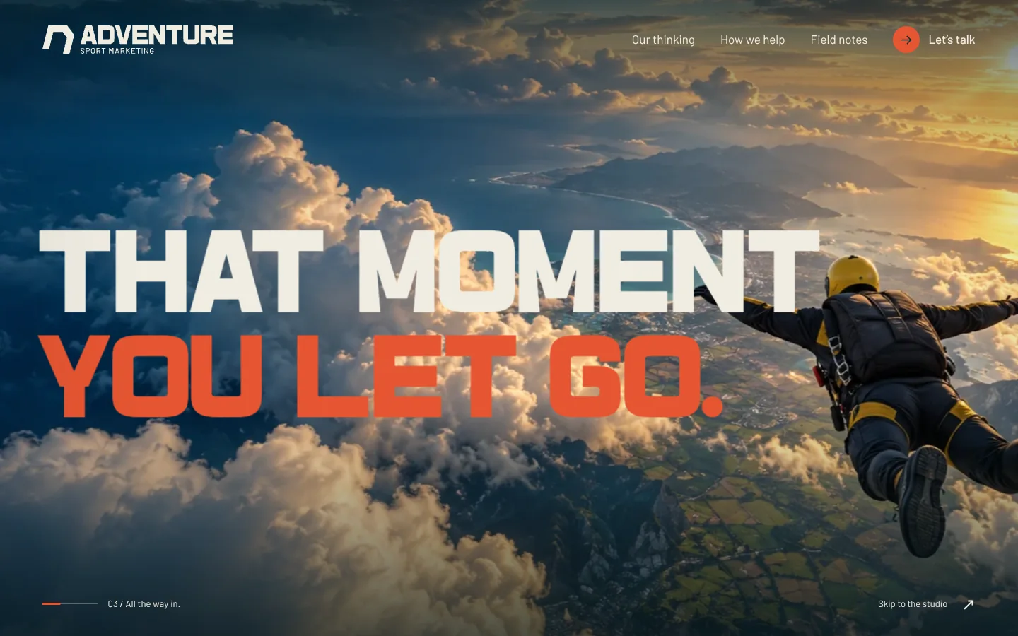
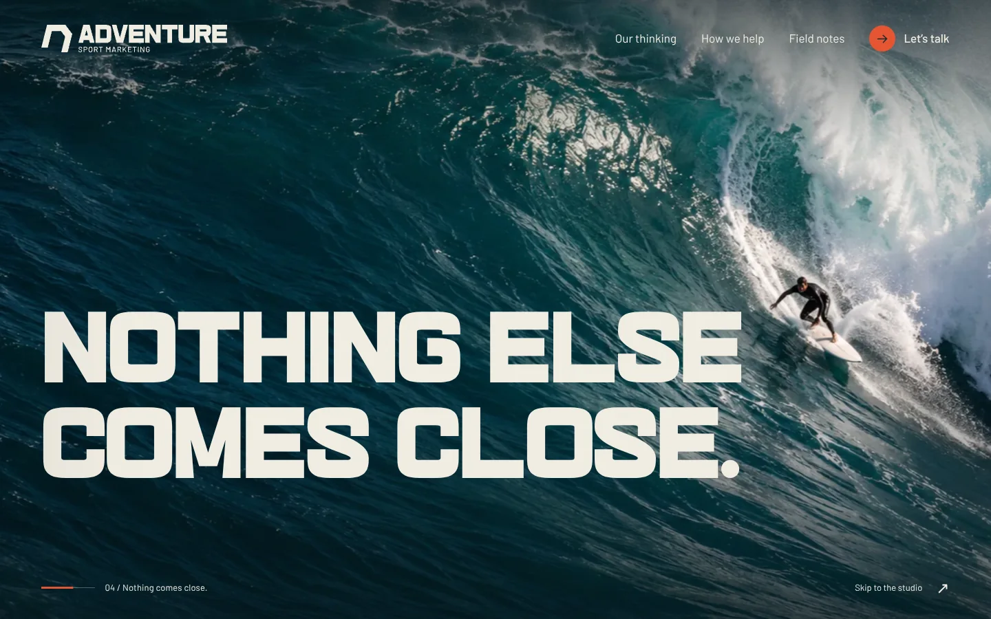
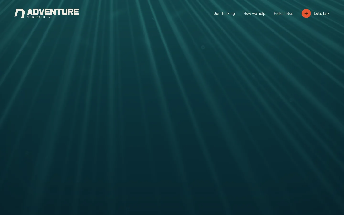
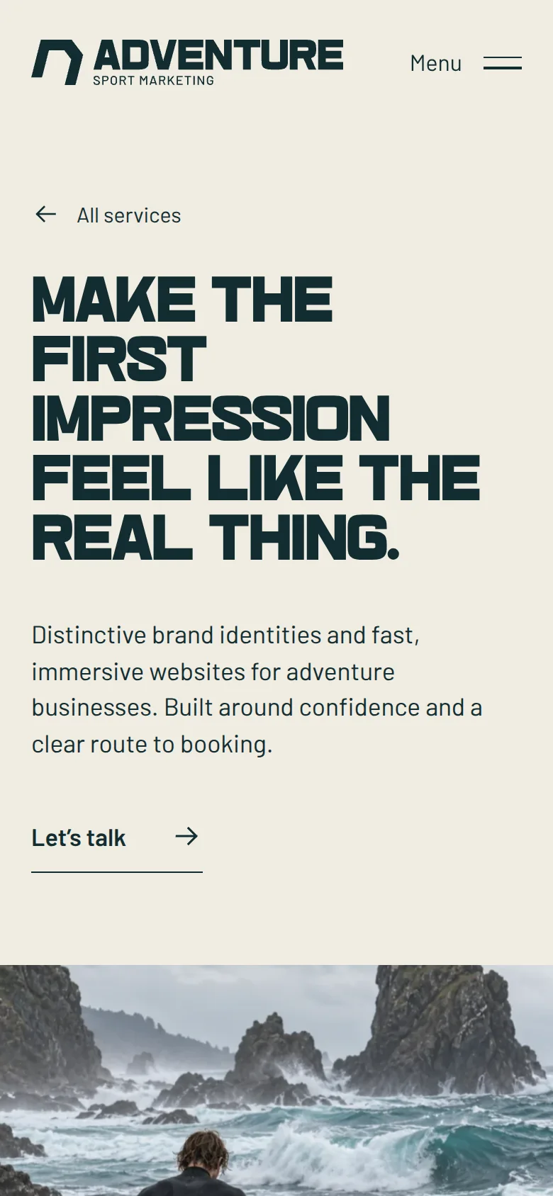
The homepage starts on a mountain ridge, moves through clouds and freefall, then opens through the Entry mark into surf. An animated ocean becomes the final transition: the visitor passes below the waterline before arriving at the studio.
Each scene has its own rhythm. Layered images, large type and atmosphere move with the scroll, with pauses that let the composition settle. The journey uses native scrolling, with an option to skip straight to the studio or reduce motion.
Beyond the opening, the identity carries through the studio’s thinking, three service pages, three field notes and an enquiry page. The experience has a destination as well as an entrance.
04 / THE SCOPE
What went into it.
- 01
A visual identity built around Entry.
The angular doorway, outlined wordmark, colour palette and typography create a compact identity that can live in a still image or become part of an interaction.
- 02
Art direction and scene composition.
Mountain, cloud and ocean imagery was developed into a consistent visual world, then layered with typography and the Entry aperture. The imagery is conceptual visual development.
- 03
A choreographed homepage.
The sequence connects the mountain, freefall, surf and underwater scenes. Cloud and ocean effects add atmosphere; the final descent hands the visitor into the studio content.
- 04
The website beyond the spectacle.
Studio thinking, strategy, brand and website services, marketing services, field notes and an enquiry composer give the concept a complete site structure.
- 05
Different ways to experience it.
Responsive layouts, reduced motion, skip controls and static fallbacks keep the content available across devices and when the effects are turned off.
05 / THE RESULT
Where it stands.
A complete website prototype and a visual identity that runs through the experience. The reward here is the exploration: taking a simple doorway and seeing how far it could carry the idea.
Personal project · In development. Planned home: adventuresportmarketing.com — not live yet.
Talk about the project