
Brand identity / Art direction
ProTech Branding.
A friendly, expressive identity for a business that wants workplace learning to work for every brain.
- My role
- Brand identity, art direction and visual system.
- Project
- Brand identity project
01 / THE BRIEF
A human identity for human skills.
ProTech brings a neuroinclusive approach to human skills training for tech teams. Its identity needed to communicate that point of view and give the business a recognisable way to show up.
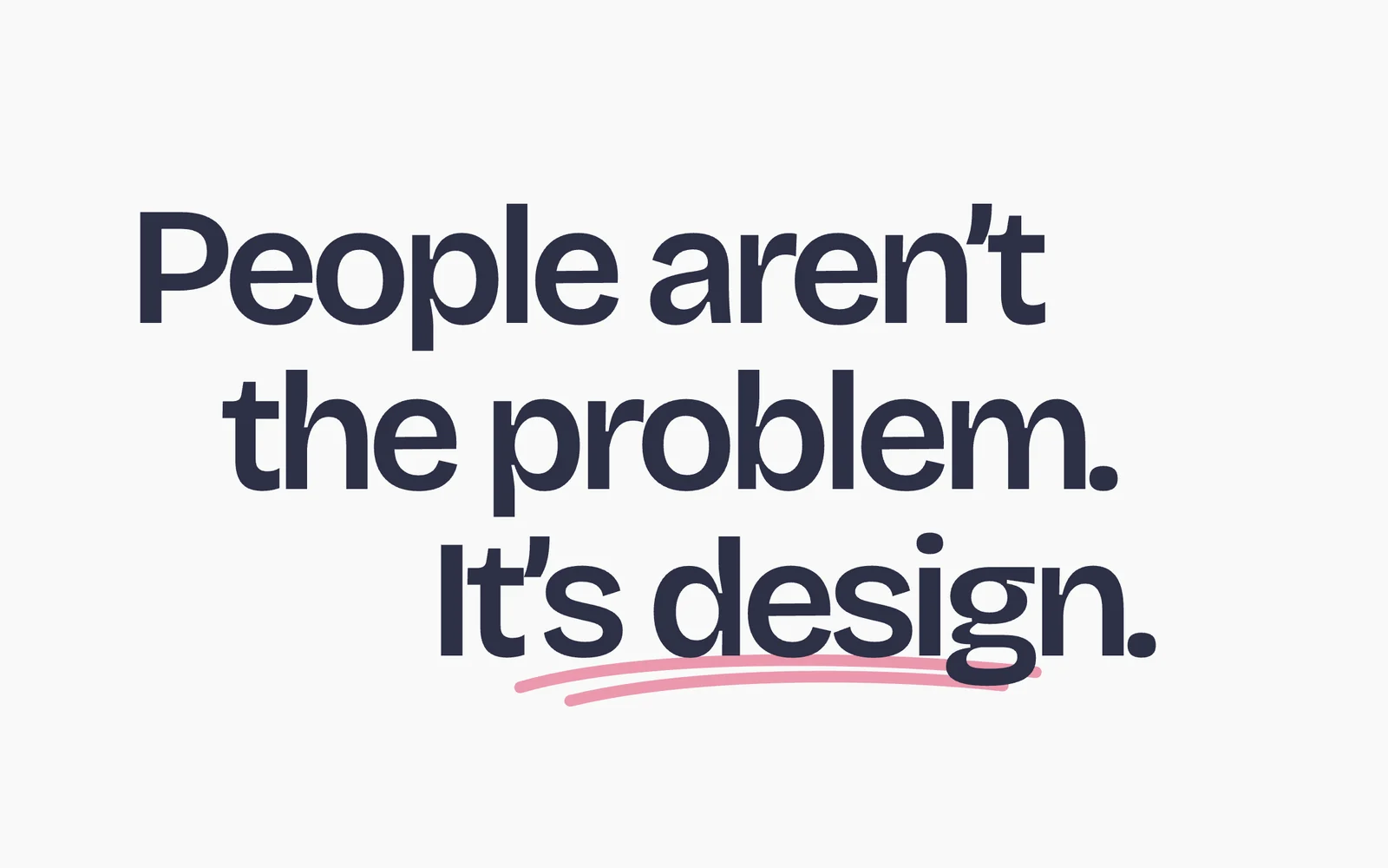
The starting point was a simple idea: people aren’t the problem. It’s design. The brand needed to feel human and approachable, with enough structure to carry detailed training content.
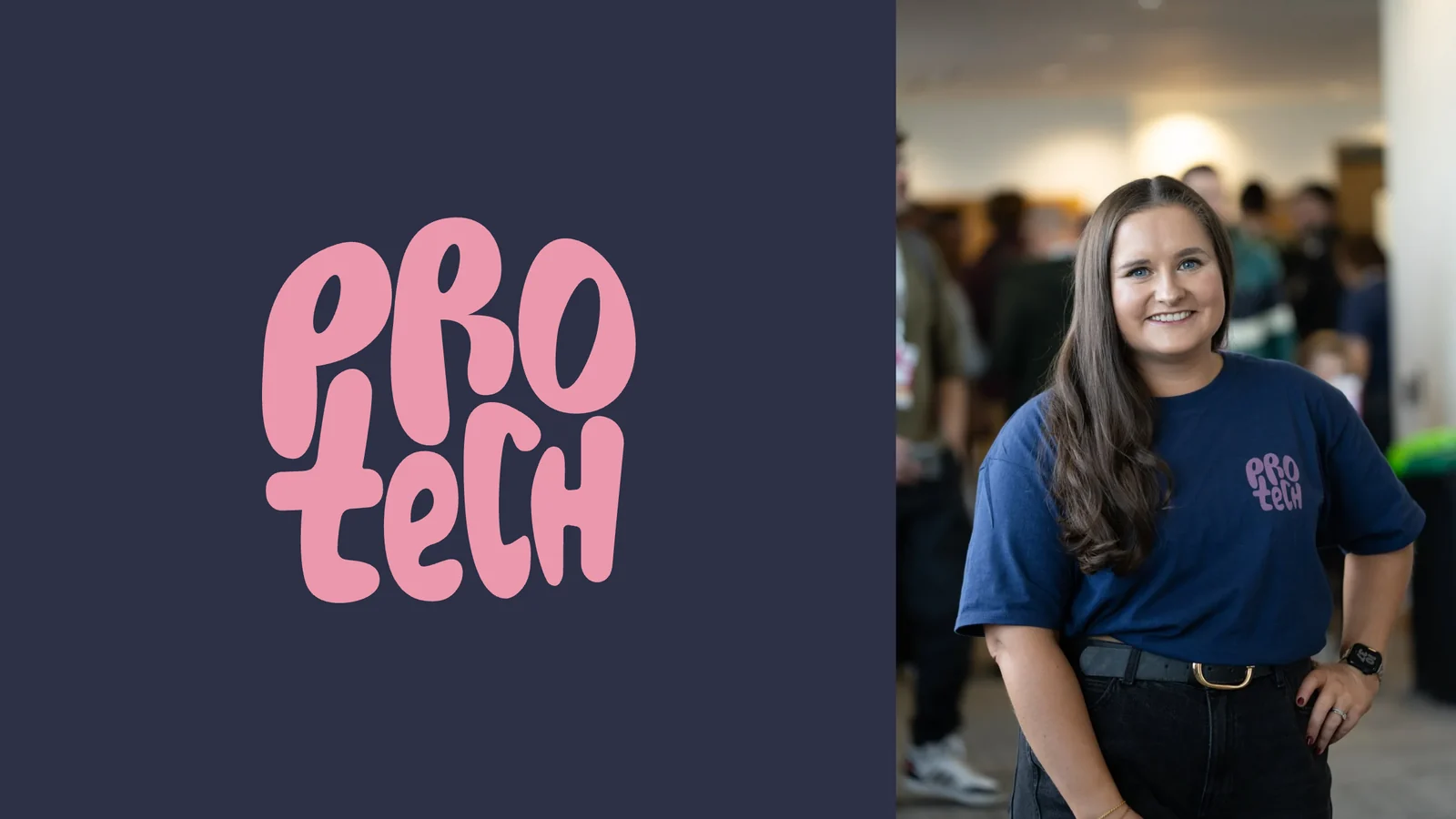
The identity, out in the world.
02 / THE IDEA
Make room for different ways to learn.
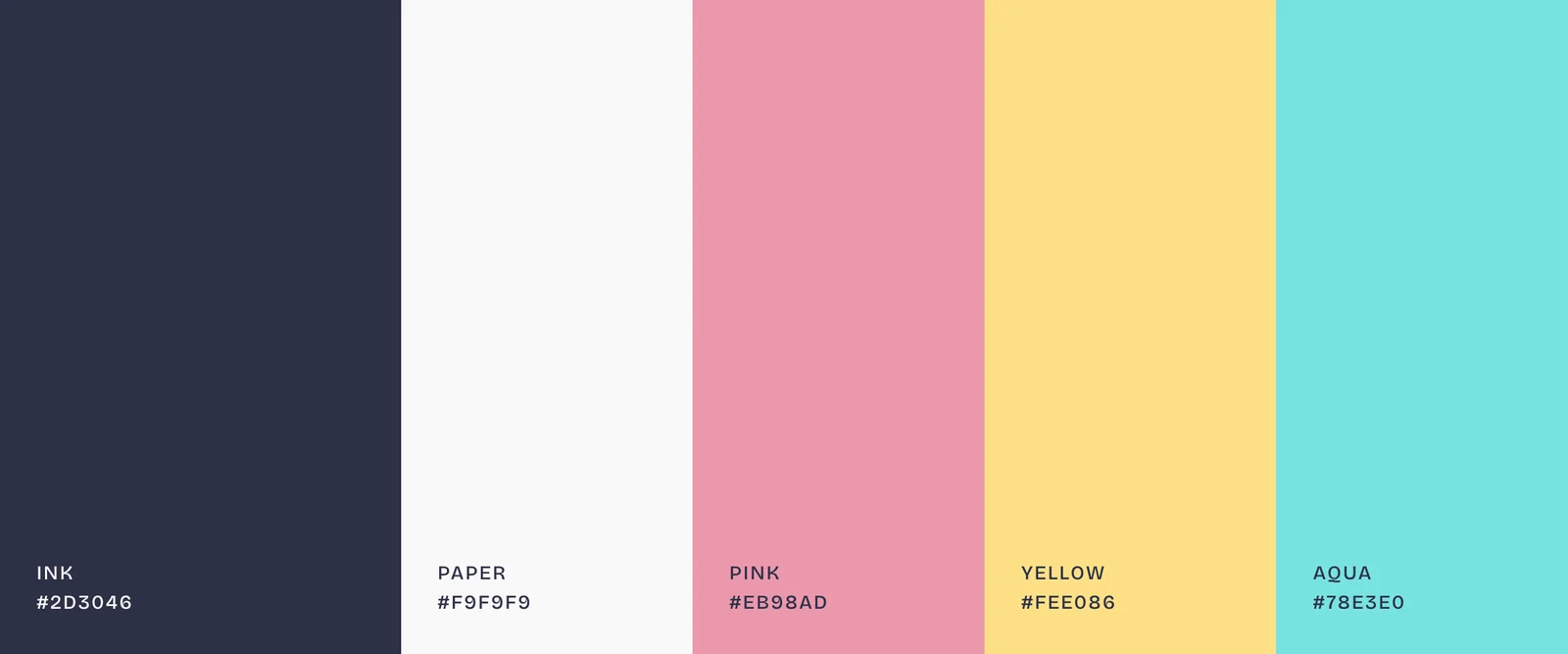
I built the identity around the contrast between expressive shapes and clear information. The hand-drawn logo gives ProTech a friendly voice. Ink and paper provide a calm base for reading, while pink, yellow and aqua draw attention to what matters.
The wiggle is part of the same visual language. It can be a single ribbon, a cropped shape or a full pattern. Stickers and underlines bring that character into everyday communication, giving important words and actions a clear place on the page.
Five colours. Clear roles.
03 / THE BUILD
One recognisable set of parts.
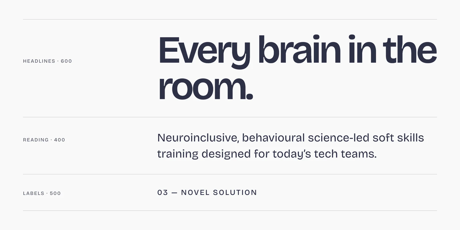
The identity is a set of parts that work together: the hand-drawn mark, a five-colour palette, Bricolage Grotesque, loose ribbons, a repeat pattern and a simple annotation system. Large headlines lead; smaller text explains. The graphic elements support that hierarchy.
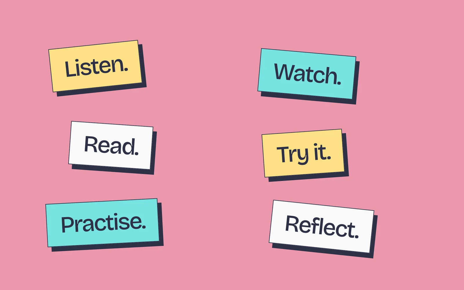
Six stickers label different ways to engage: Listen, Watch, Read, Try it, Practise and Reflect. Each uses the same outlined card and offset shadow, so the labels feel related while staying easy to distinguish. A hand-drawn underline adds emphasis without another typographic style.
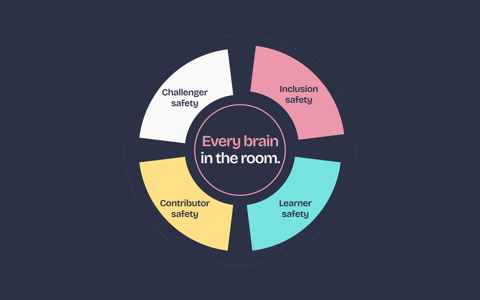
The colour system also gives ProTech’s NeuroSync wheel a clear structure. Inclusion, learner, contributor and challenger safety each have their own segment and colour. The methodology belongs to ProTech; this work gives it a visual expression.
The same identity continues into the website, founder clothing and presentation material. The website design has its own linked case study, showing how the visual system becomes an interactive experience.
04 / THE SCOPE
What went into it.
- 01
The hand-drawn mark
Rounded, irregular letterforms give the name a compact and recognisable shape, with a pink-on-ink treatment that anchors the identity.
- 02
Colour with a purpose
Ink and paper provide the reading foundation. Pink, yellow and aqua carry emphasis, labels and distinctions within the system.
- 03
A clear typographic hierarchy
Bricolage Grotesque connects large, closely set headlines to readable supporting text and small functional labels.
- 04
Ribbons, patterns and annotations
The wiggle, repeat pattern, stickers and underlines make the identity usable across different formats without relying on the logo alone.
- 05
Methodology made visible
A four-part NeuroSync wheel uses the palette to organise the method and give each form of safety a visible place.
- 06
Identity in use
The visual system carries through the website, branded clothing and presentation material. The portfolio cover adds a short wiggle-to-logo animation.
IN THE DETAIL
A closer look.
Say it big.
Six ways in.
Underline what counts.
A line with personality.

From a line to a pattern.

Give the method a shape.
05 / THE RESULT
Where it stands.
A connected identity that gives ProTech a recognisable voice across its communications. The logo establishes the character; the colours, type and graphic elements make that character useful beyond the mark.
Brand identity and visual system for ProTech Your Skills. Original supplied brand artwork; a bespoke SVG animation presents the identity in motion.
Explore the website design