
Brand identity / Art direction / Editorial
Best Gyms Guide Branding.
A visual identity for an independent gym guide. A volt-yellow pin, a three-mark fact key and one question connect the launch campaign, guide covers and gym-window decal.
- My role
- Brand positioning, visual identity, art direction and editorial design.
- Project
- Independent brand identity
01 / THE BRIEF
What makes a gym the best?
When I worked in personal training and gym sales, people chose the same gym for very different reasons. An early opening might matter more than the size of the weights room. One person wanted a pool. Someone else just wanted somewhere they would keep going.
I wanted a voice for Best Gyms Guide that made room for those choices.
02 / THE IDEA
The one you go to.
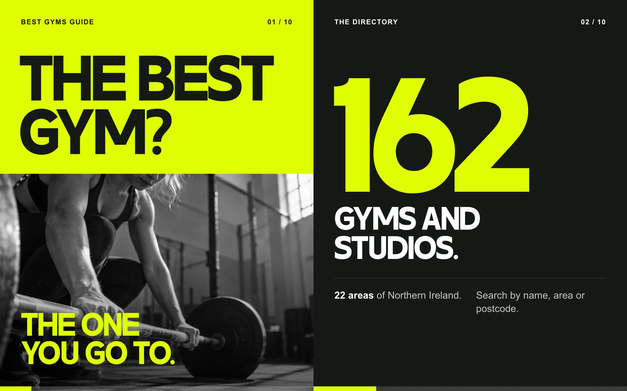
“The best gym? The one you go to.” The question and answer gave the launch its rhythm. Put the question in oversized type, give the answer its own space, then back it up with something useful.
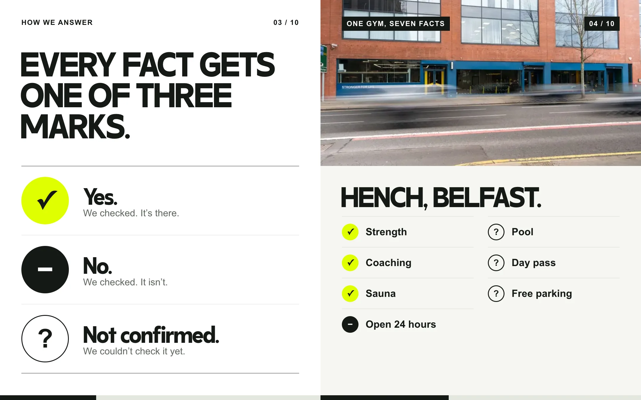
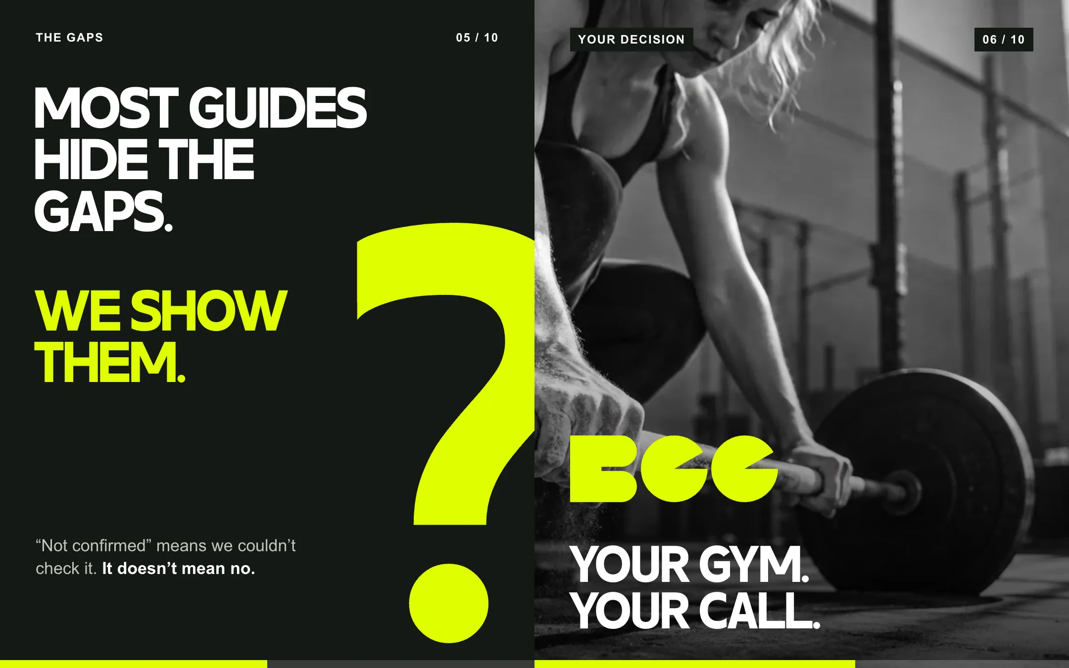
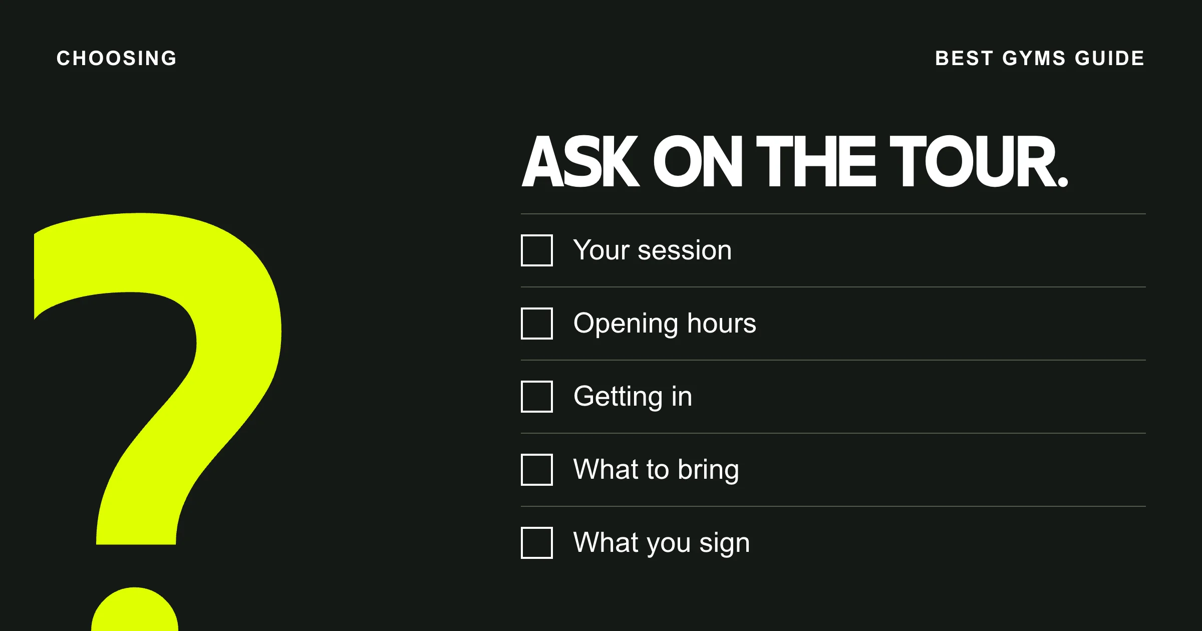
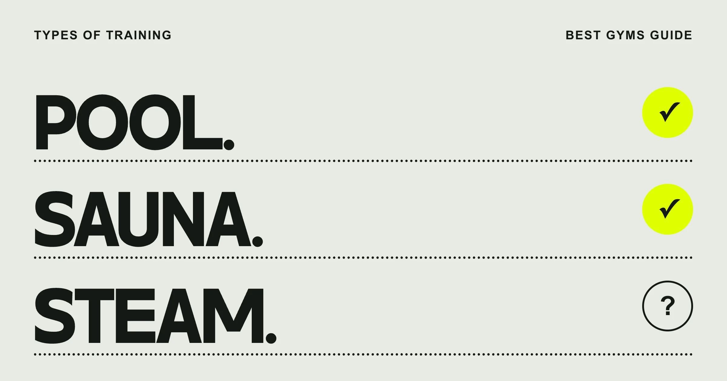
A tick, a dash and a question mark became a small graphic vocabulary for the brand. In the fact key, they mean yes, a checked no or an open question. On a campaign slide, a single question mark can fill the page.
How to read a listing
03 / THE BUILD
An identity that travels.
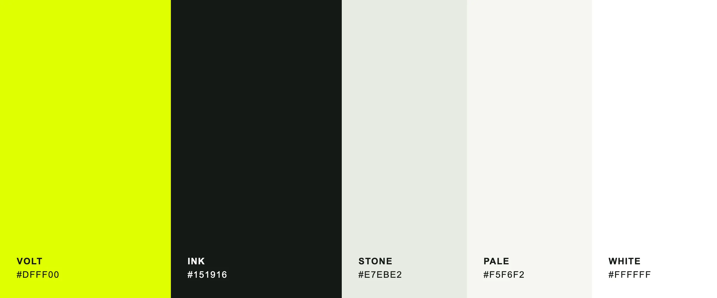
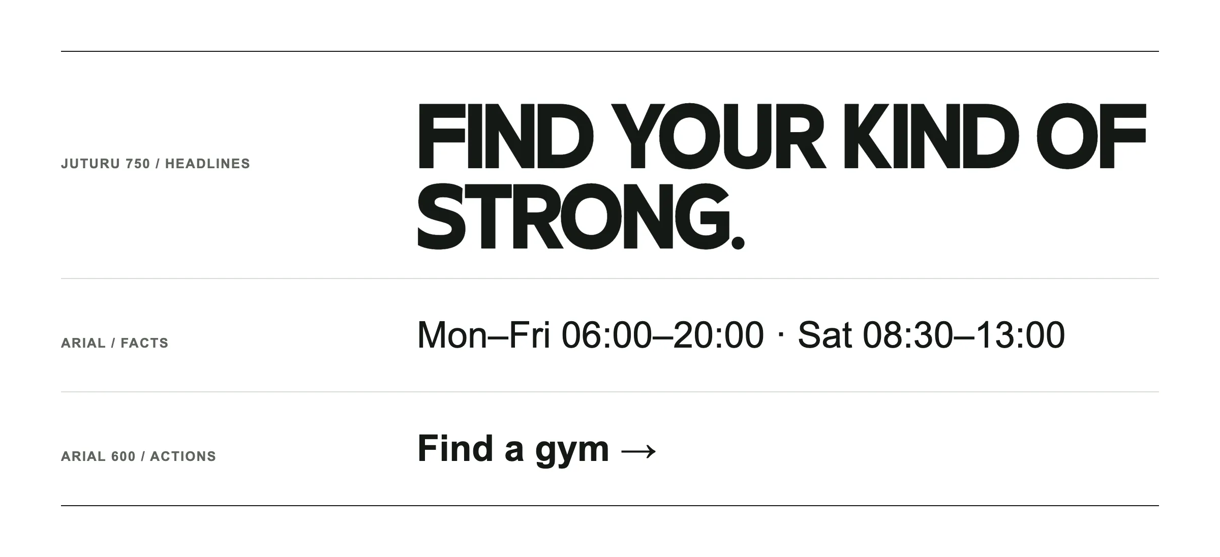
I paired volt yellow and ink with quieter neutrals for the detail. Juturu 750 carries the headlines. Arial carries prices, times and actions. The BGG mark stays compact enough to sign a guide cover or read across a gym window.
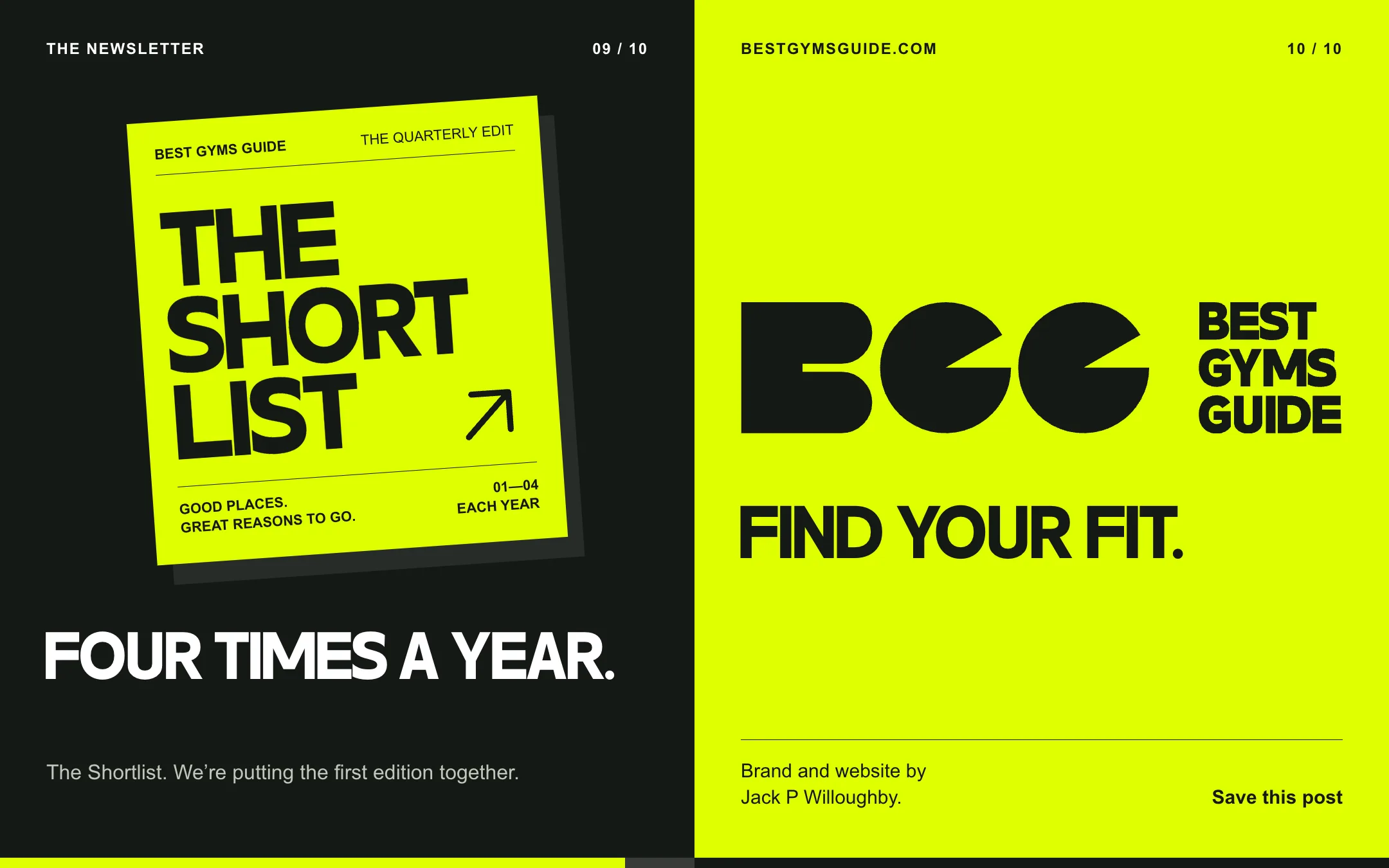
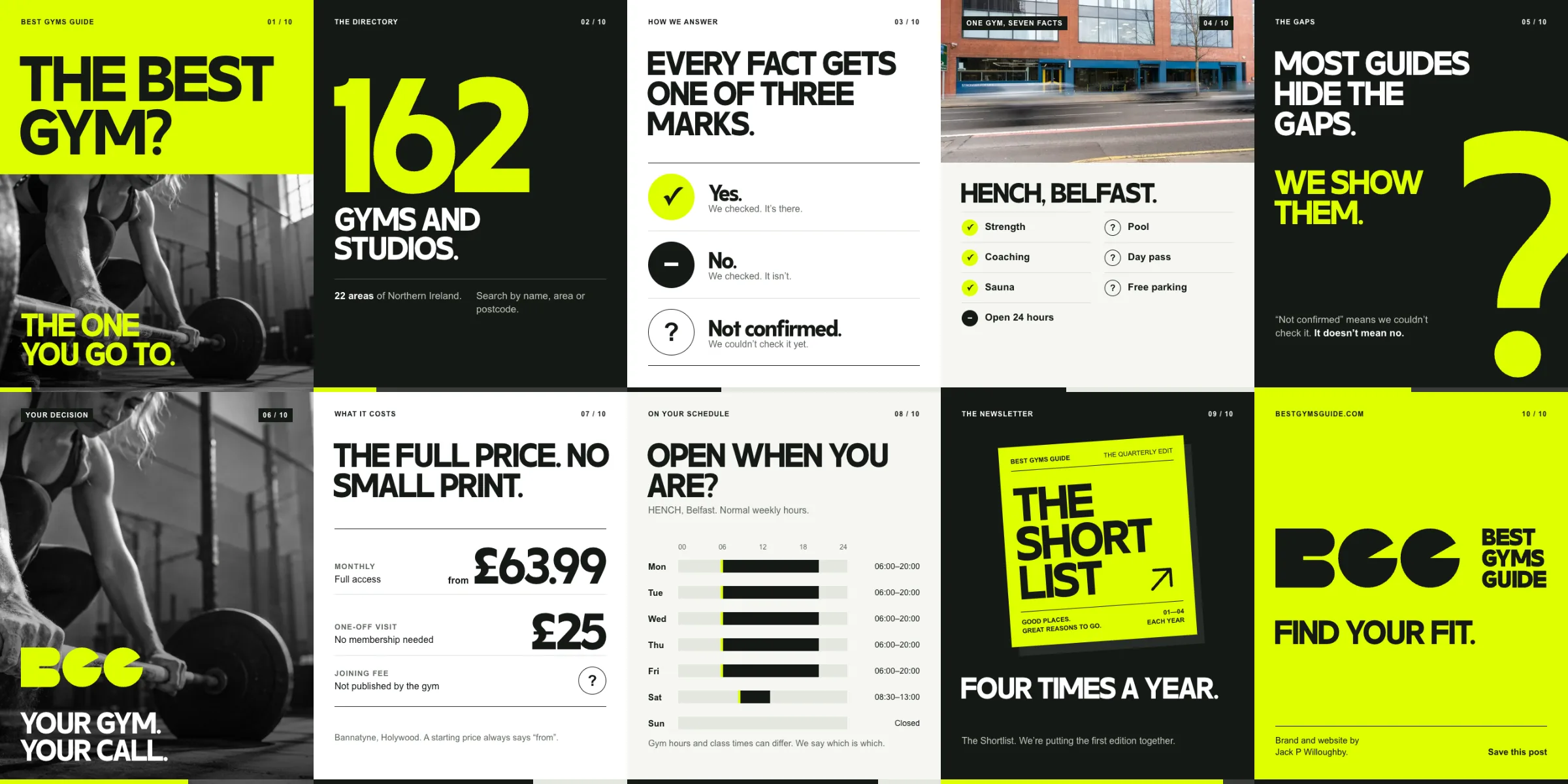
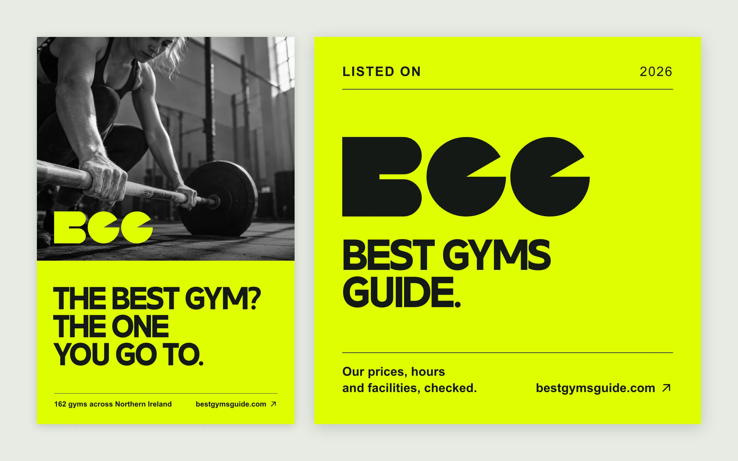
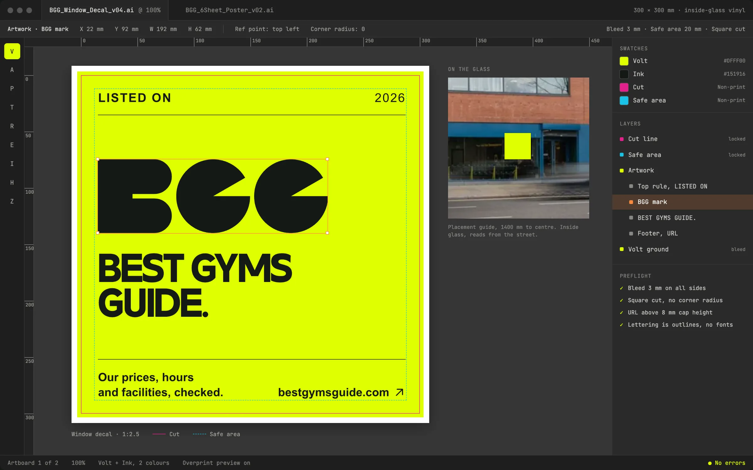
I applied the system to a ten-slide launch carousel, The Shortlist quarterly edit and nine editorial covers. The poster speaks to someone looking for a gym. The “Listed on” decal gives the venue its own part in the identity.
Colour and typography
Colour
Typography
Inside the launch campaign
Showing the gaps
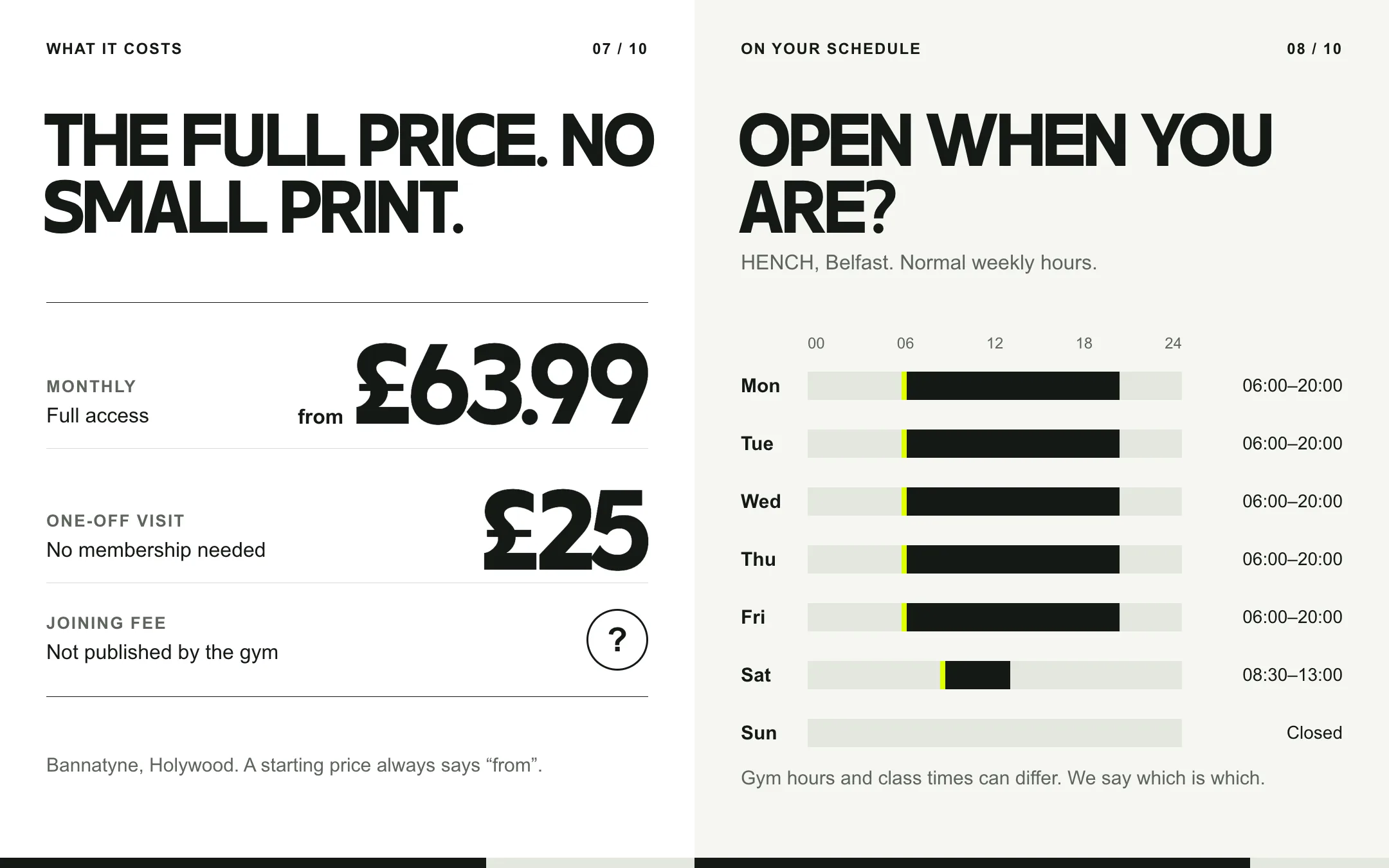
Price and opening hours
The Shortlist
The ten-slide sequence
In the gym window
Poster and window decal
The decal in production
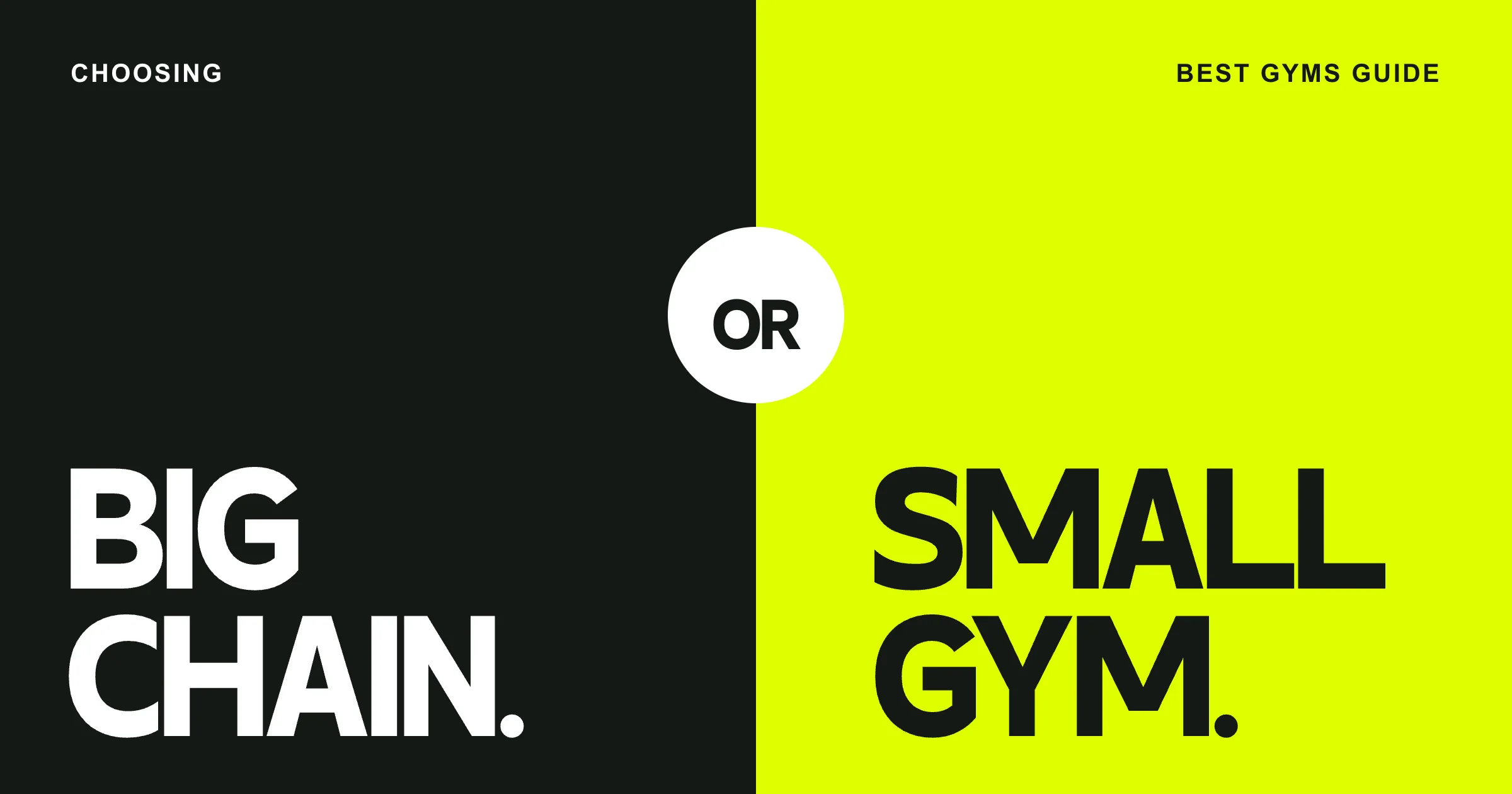
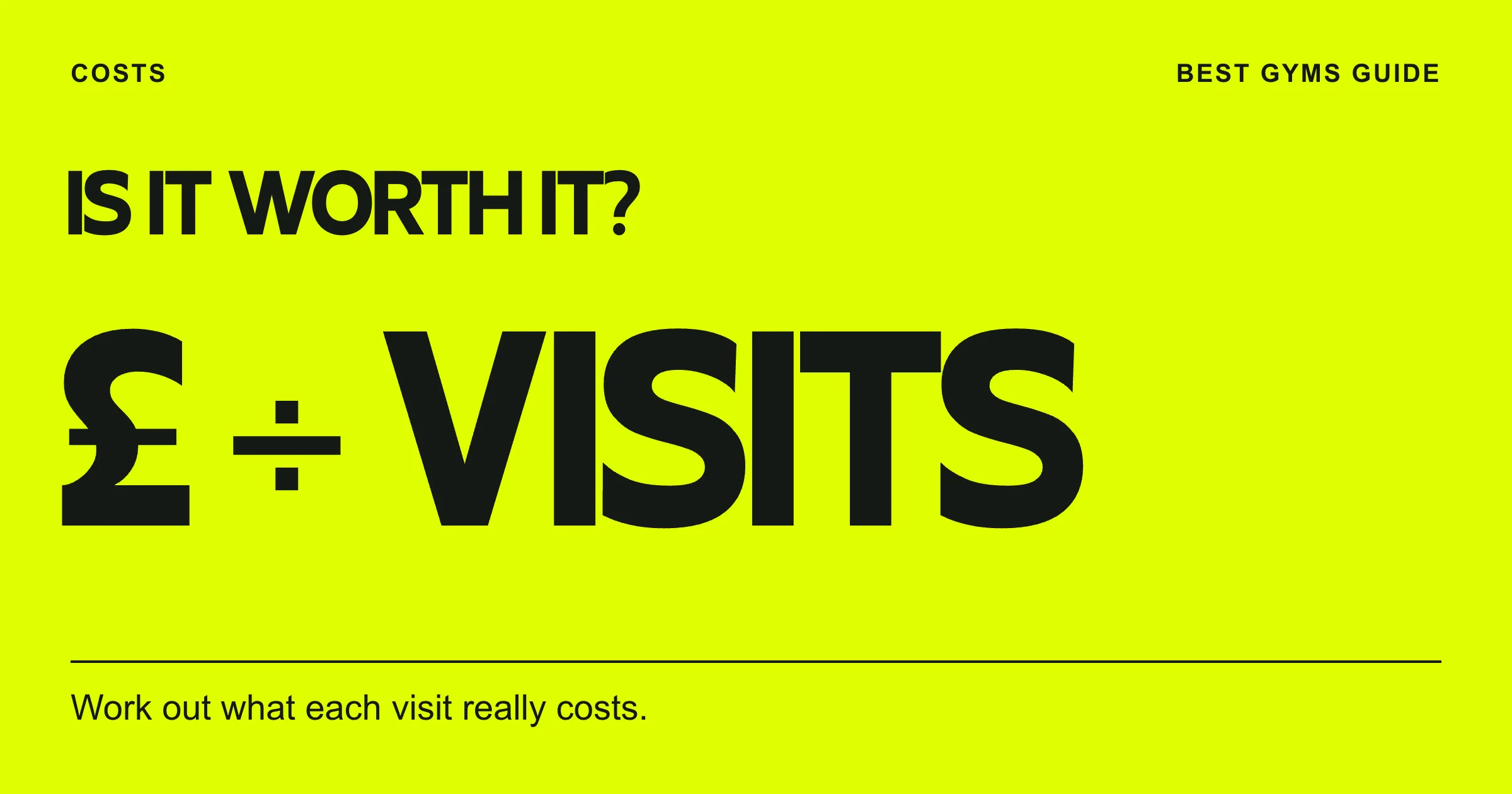
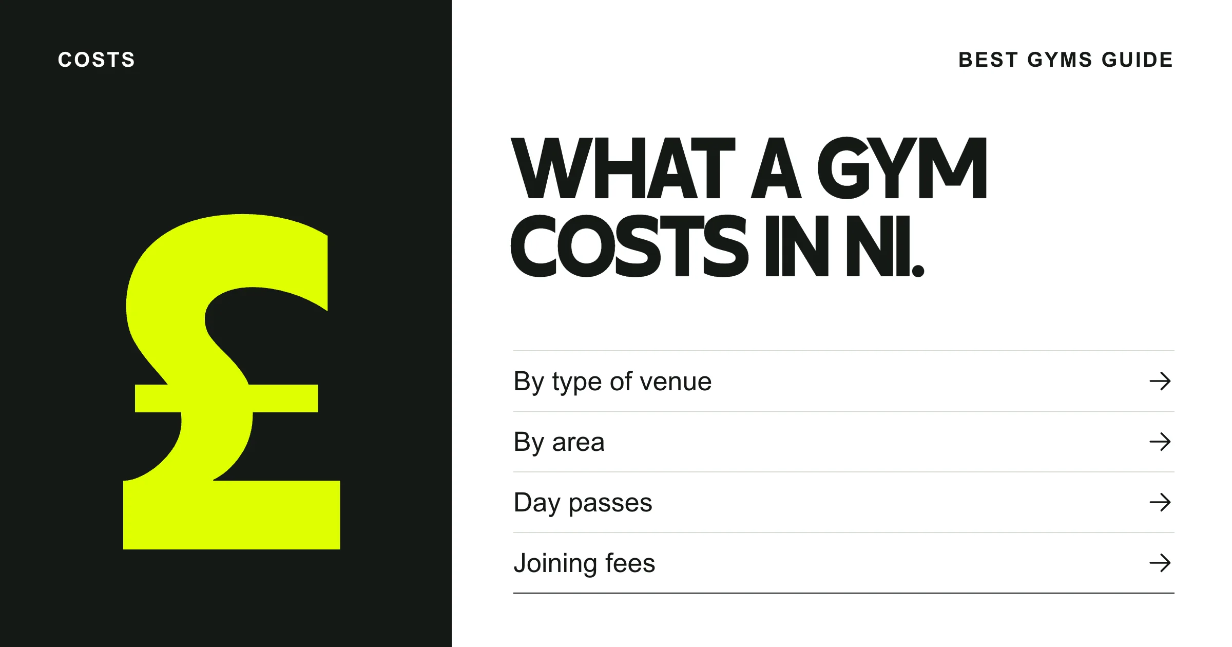
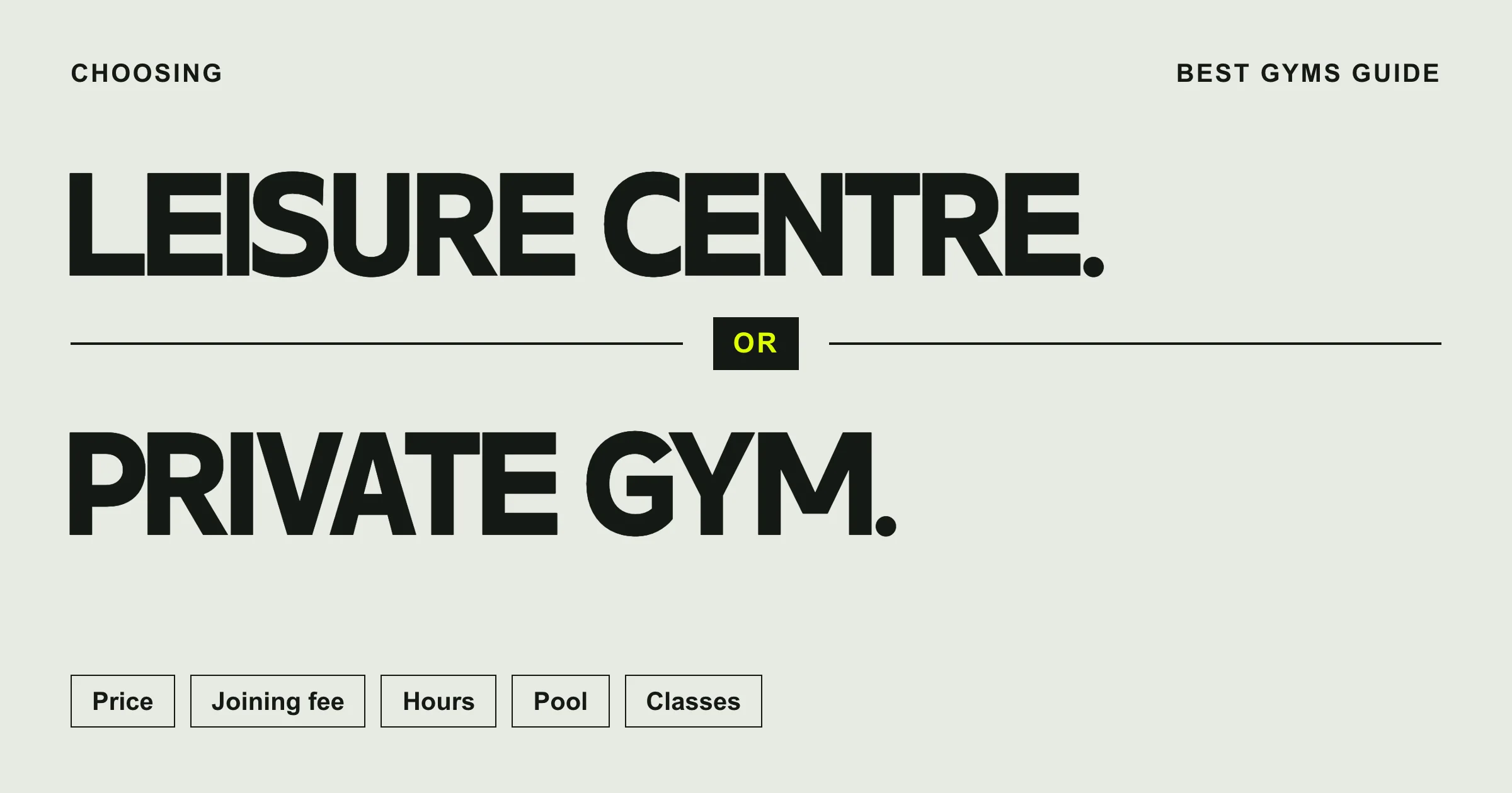
Nine editorial guide covers
Big chain. Small gym.
Make the value visible.
Ask before you join.
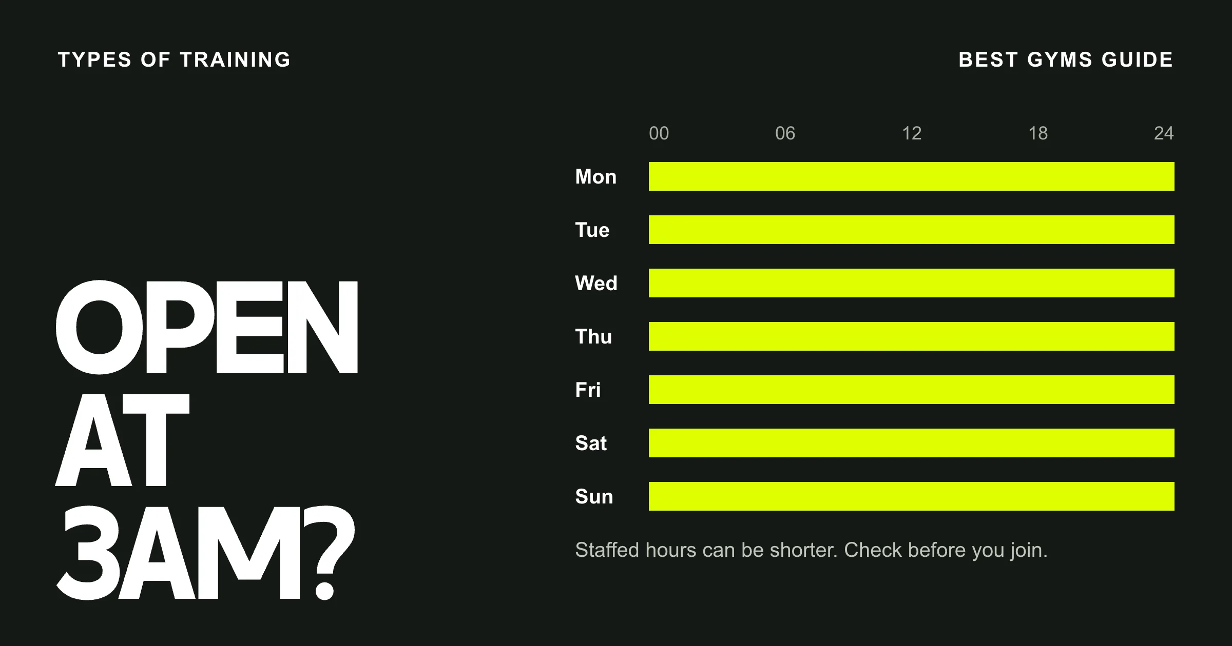
Fit the ordinary week.
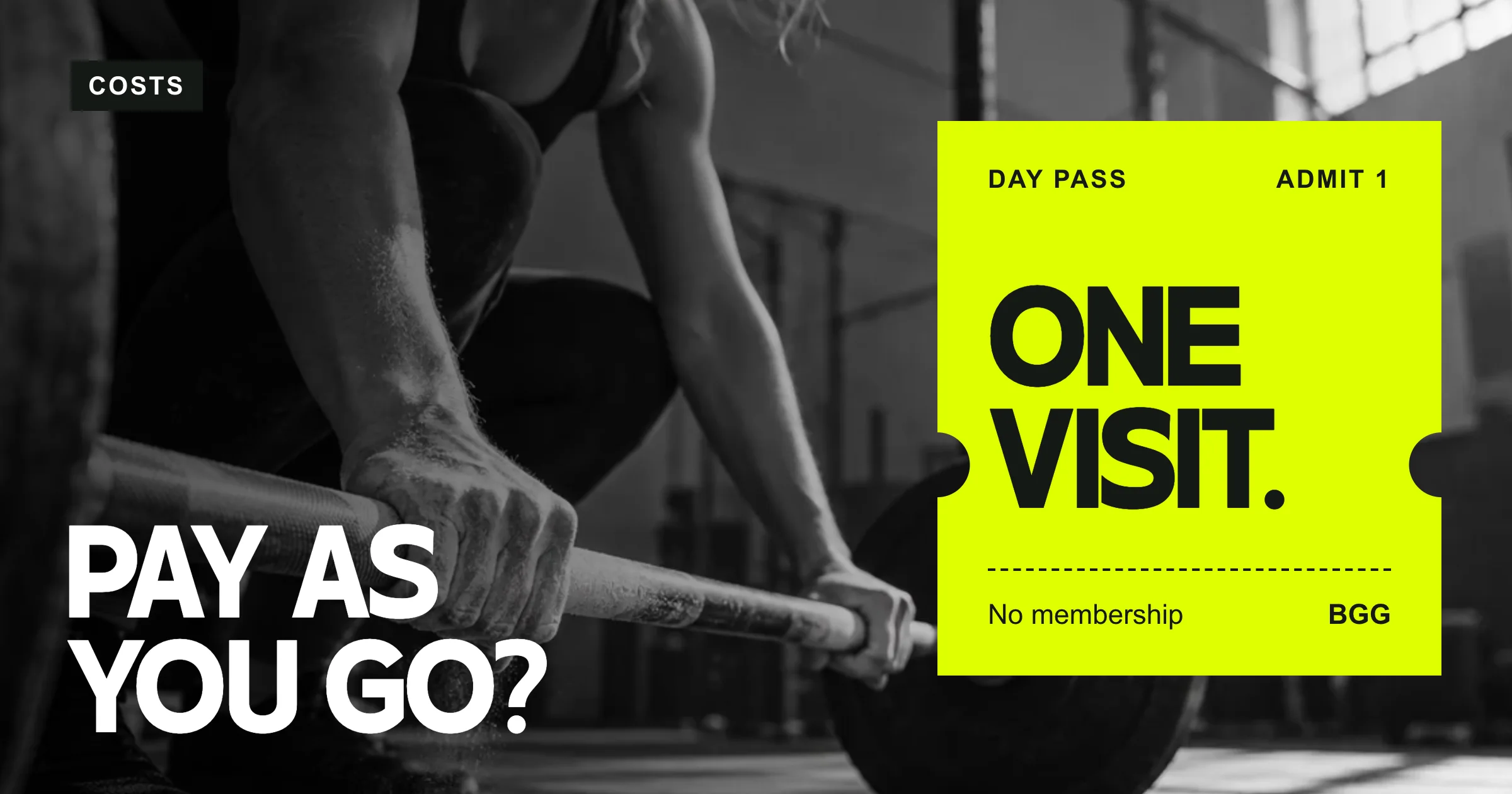
Try it for a day.
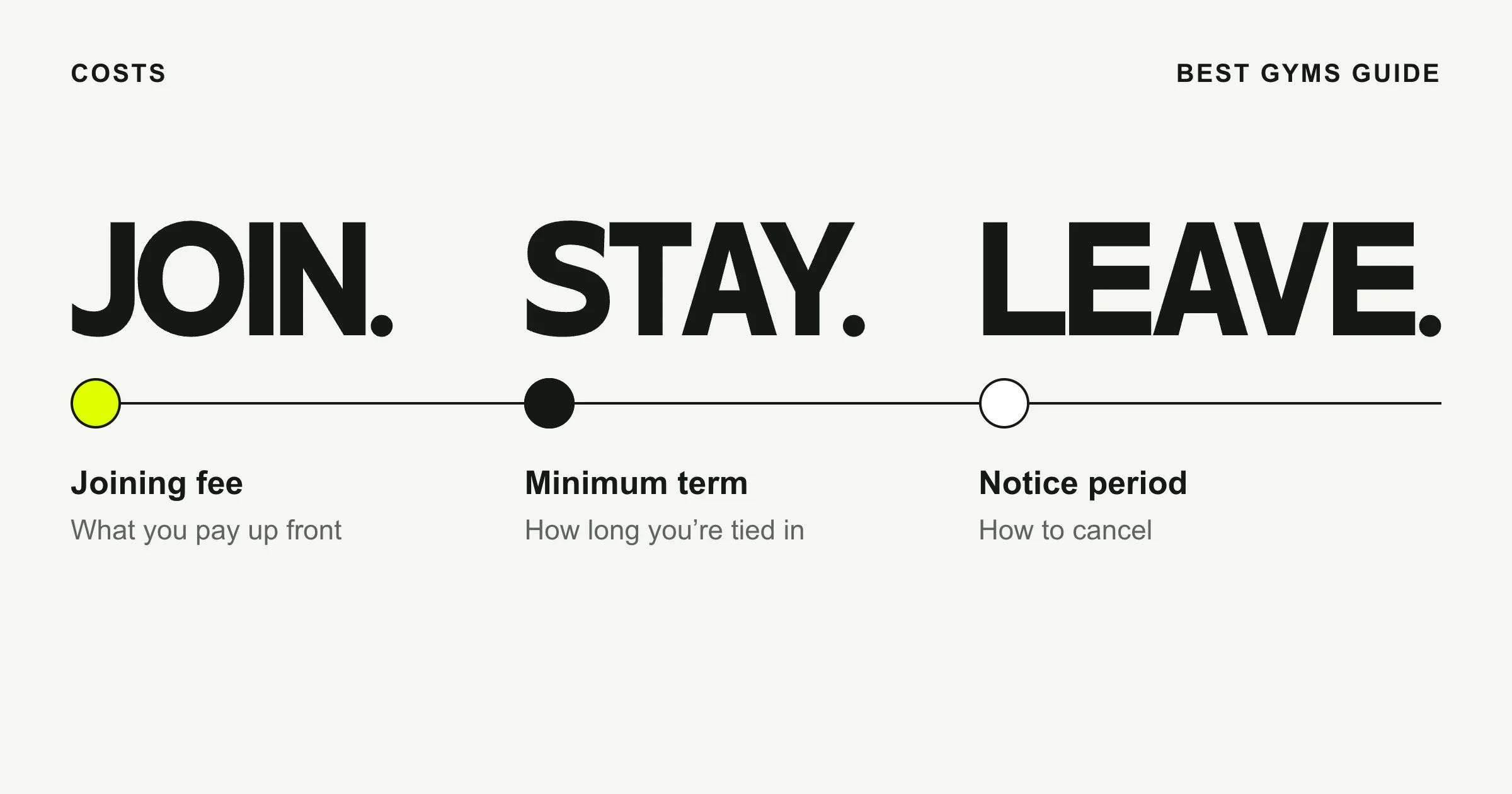
Join. Stay. Leave.
What it costs.
Know what is included.
Compare what matters.
04 / THE SCOPE
What went into it.
- 01
Positioning and voice
A question-and-answer campaign line grounded in the reader’s own training routine.
- 02
Identity and motion
The BGG mark, full-name lockup and a short pin animation for the brand in motion.
- 03
Type and colour
A five-colour palette with separate type treatments for display headlines and practical details.
- 04
Campaign and print
A launch carousel, gym poster and window decal sharing the same graphic language.
- 05
Editorial design
A cover for The Shortlist and a family of nine guides covering costs, facilities and first visits.
05 / THE RESULT
Where it stands.
The identity works at two very different scales. On a poster, the opening question does the talking. On a guide cover, a price calculation, a checklist or a weekly timetable can carry the whole idea. The mark, type and colours tie the collection together.
Independent brand identity for Best Gyms Guide.
Discuss a brand identity